Posts Tagged Visual Language
Lean Coffee?
Posted by nthorpe in Uncategorized on September 4, 2014
You know how Melbournites can get about our coffee – if you dis my macchiato dealer, you’ll get into a stoush faster than you can say “Carlton sucks”.
One of my locals is the Postal Hall. I was intrigued recently by the particular visual dialect they use to make their tasks and queues visible. Look at the pictures below:

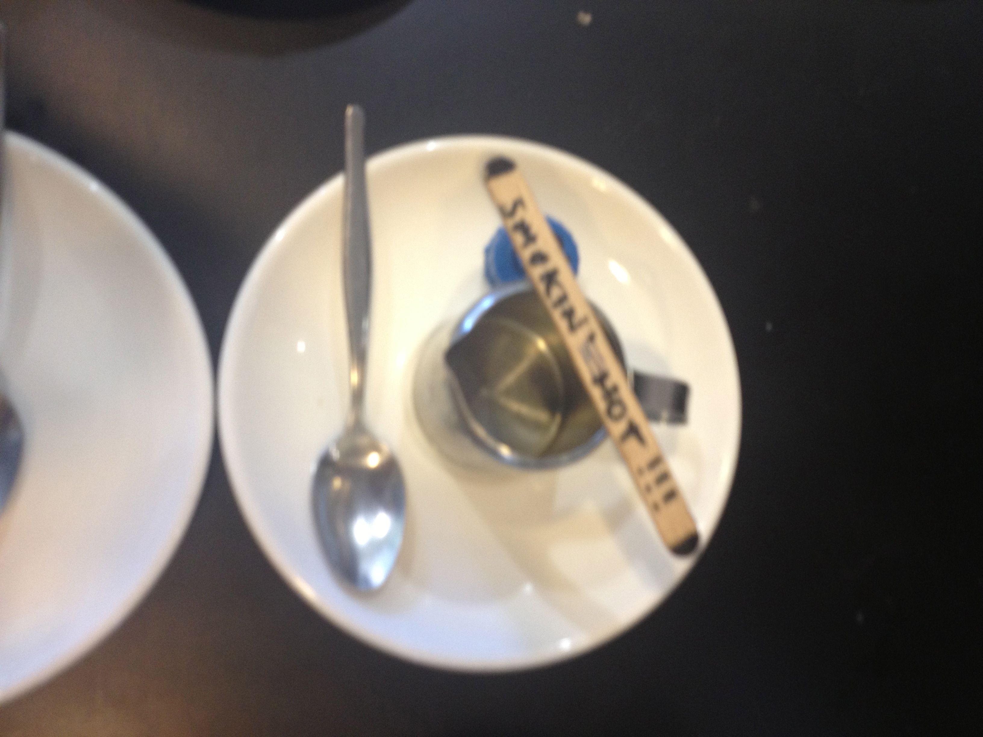
This is a queue. And the arrangement of spoons, bottle caps and milk jugs are the visual language.
The first cup in the queue is a flat white (milk jug) for the outside right table (see bottle cap), with one sugar (1 spoon). And it’s followed up by a cafe latte with two sugars for the same table.
If customers have a special requirement, this is signalled with the use of an ice cream stick: “smokin hot”!
The waitstaff bring the jobs in and set them up, and the barista creates the brew. No need to read a list, a quick glance at the setup tells the barista all he needs to know.
Next up, WIP queue limits?
For another example of lean in the fast food industry, see Nigel Dalton‘s classic post here.
We’d love to hear of other examples. Seen any lately?
Spotted: Postal Hall, 116 Russell St, Melbourne.