Posts Tagged Prioritisation
Hacking Trello
Posted by fe in Uncategorized on September 4, 2014
In my experience, digital card walls don’t really cut it. For me, they can’t compete with the tactility of the real thing – I just don’t get the same kinesthetic feedback when I move a card on a digital board. However, they are a reality of working life for many teams and I’m pretty excited to post our first Digital board hack here!
One of our readers works in a team who’d struck just this problem. A restructure meant that they were suddenly working with remote teams and their trusty cardboard and sharpie system didn’t cut it anymore. One of the things that didn’t easily transition over was the system of icons that they used to indicate things such as Blocked, Kicked Off, Bug. You know, those ones we have such fun printing, cutting, laminating and sticking on the front of cards to tell us all kinds of useful stuff.
The solution is actually pretty simple. Set up dummy users in Trello and give them profile pics that represent Blocked, Bug, etc. Add them as ‘members’ to cards and therefore see the “blocked” icon badge on it. As Dave tells it:
“[We] set up dummy email accounts associated with icons in gravatar.com. Then we could add them as members to our Trello board and use the icons as status stickers for our cards. [We gave them] all the same prefix as board member names (“z_blocked”, “z_kicked_off”, “z_walked_through”) [so that] these icon accounts are all … together in any listing.”
Great idea!
What we said vs. what we did
Posted by fe in Lonely Planet, Lonely Planet SPP Dev Team on April 14, 2012
Are the stories that are talked about in planning always the ones that actually get played during a sprint? In an ideal world they are, but seldom does a sprint run according to the ideal.
This team was getting a lot of work done, but still seemed to have cards left over at the end of a sprint. Were the cards taking longer than expected? Were additional cards being added? No one could quite be sure.
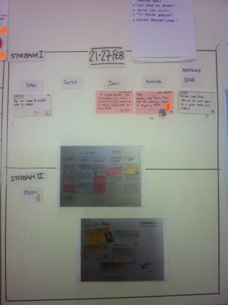
One of the team members came up with a solution. After the team had agreed the stories that would be played for the upcoming sprint, he took a photo of the cards. This provided a visual record of what the team had agreed would be done.
It was stuck up next to the backlog and as cards were completed they were ticked off on the photo. At the end of the sprint it was easy to see what had got done, or not, out of the planned cards, and which new cards had been added into the sprint.
This is a great example of a team member taking matters into their own hands and using their own visual language (photographs) to come up with a fresh take on planning.
Spotted: SPP development team
Making Sense of Tech Debt, Fast
Posted by nthorpe in If we tell you we'll have to kill you on April 10, 2012
Fabio Pereira uses this method to help teams quickly prioritise tech debt. In this example, the team held a Tech Debt retro where they brainstormed all the technical debt they thought they had accrued since the start of the project.
“Technical Debt” is postponed work created when a team takes some technical shortcuts in order to get a solution out fast. These shortcuts create a “debt which must be paid back later. It’s often hard to know where to start on addressing this “debt”.
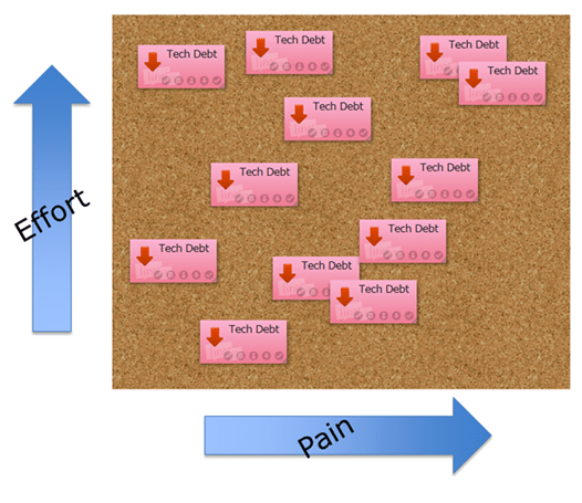
The team then classified the debt on two axes this way:
“The relative effort that the team would have to spend in order to pay this debt.“
“Pain is the direct impact on productivity that this debt causes. (interest)”
This made it easy for them to decide what to tackle first. “Lets start on the high value work which takes the least effort”!
Fabio says: “One interesting thing that came out of our retro was that the High Return section was almost empty. We came to the conclusion that this was a good sign, it means that we had already fixed most of the LowEffort/HighPain debt during the normal development. Which is exactly how this type of debt should be paid.”
Release Radar helps you see through the fog
Posted by nthorpe in If we tell you we'll have to kill you on February 10, 2012
 A common or garden Agile board is good for a view of the iteration you’re in, and perhaps a little further out. But what about when you need to see even further? Agile teams often face the problem of “boiling priorities”. Priority changing on big pieces of work daily. You start to work on them, and then you hear they have been de-prioritised. It’s hard to know what you should be working on. The team can churn through a lot of brain cycles thinking about pieces of work which may or may not eventuate. This can be stressful.
Sometimes we need to be vaguely aware of pieces of work which are “out there” in the future, whilst still keeping our focus squarely on what we know is coming next. Different roles in the team, too, have different time horizons they need to care about. For Project Managers, or Business Analysts who need to organise and run inception activity, it’s good practice to keep an eye on what’s coming down the pipe. For developers, it’s often: “Meh. Just tell me what I need to do next.”
Daniel Aragao showed us a great way to deal with frothing priorities – the release radar.
Here he has trained his radar across the portfolio:
– each concentric circle represents time (12,9,6,3,1 and .5 month). Items far out on the radar are distant in time, items nearer the centre are closer in time
– each slice is a project, identified by a post-it on the outer rim
– resources working on the project are also on the outer rim – these will be avatars in the future
– each post-it represents a task, module, something that is big enough to be picked up by the radar
– post-its will be colour-coded to show the size of each task. T-Shirt sizes (S-green,M-yellow,L-orange,XL-red)
– IT, Ops and Business get together every 2 weeks to update the Radar and discuss associated risks
On our team, we took the idea and adapted it to our needs. Our radar simply tracks pieces of work as they orbit our world, and then come in to land.
The purpose was to be able to provide steady priorities to the team (they only need to look at the innermost ring), to help our BA structure her work with stakeholders on preparing epics, and to get a view of the whole pipeline if we needed it. We keep it on the back of the iteration board, and a subset of the team meet once a fortnight to update it. It tells us what we need to actively think about, and what we can ignore.
The quadrants relate to stakeholders.
Spotted: Daniel Aragao of Thoughtworks shared this idea.
When opportunity knocks…
Posted by fe in Lonely Planet SPP Dev Team on August 26, 2011
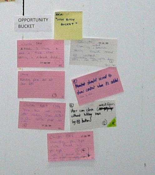
I’ve talked about cards that are never going to get prioritised and should end up in the Dead Card Cemetery. But what about small cards that are important enough to keep in the backlog, but that keep getting deprioritised behind other things in the backlog? I’m talking about the really tiny ones, often bugs, no more than half an hour’s worth of work. Maybe you could try an opportunity bucket.
A purist might say that if a card is important enough to be worked on then it will be prioritised into the backlog. But actually, there are always things that have too little value on their own to be prioritised. The team I currently work with created a ‘bucket’ of these at the bottom of their board. Cards get plucked from the bucket if it’s late in the day and not worth picking up a bigger card from the main backlog, or if they’re doing some work in that part of the code anyway and can fix something from the opportunity bucket while they’re in there. It’s proved to be a great way to knock off tiny cards that would otherwise have languished in the backlog.
Spotted: LPOS development team
The Dead Card Cemetery – where dead cards go to die
Posted by fe in LP Content Desk on May 10, 2011
Fe says: “That card might get zombied back into the backlog”.
Some cards just never seem to move up the backlog. They are always deprioritised to make way for something else. After a while it becomes apparent that they are never going to get prioritised, that there will always be something more important. But it can be hard to remove a story from the backlog – someone usually still holds that story close to their heart. It’s a good way of managing team members attachment to particular stories. It almost never happens – but if needed, a card can be brought back into play from the cemetery. It’s also a useful visual to show how many things that we think are really important at the time, actually become so unimportant that they never get done.
Spotted: Lonely Planet Content Desk
Countdown to a Milestone
Posted by nthorpe in Lonely Planet SPP Dev Team on May 3, 2011
Team says: “The days are decreasing at exactly one per day, but the feature cards definitely aren’t!”
We’ve seen agile burn-down charts many times. But here’s a different approach. This team runs a lean/kanban board, and they don’t estimate in points, so they decided not to use the traditional burn-down chart. Sometimes, there are immovable deadlines and in this case an author was going on the road to research a destination. Tickets were booked long ago and there was no possibility of delaying the release.
As the release date approached the team simply kept track of the number of feature cards versus the number of days left. This was a nice simple metric which stared them in the face every day, and gave urgency to the task of ruthlessly cutting scope to meet the date. The days always decrease of course, but the card count can increase as additional stories are uncovered. Sometimes product owners can be reluctant to cut scope, but this made it painfully obvious that it was necessary in order to meet the release date. When the number of remaining cards fell below the number of remaining days the back of the beast was finally broken.
Spotted: LPOS Team


