Posts Tagged Agile
Slickynotes look like they are worth a try
Posted by nthorpe in In the Agilista's Backpack on November 27, 2014
Index Cards and Post-its. Whiteboards. These are our utensils. We spend our days with them. We write on them, stick em on walls, we photograph them. We write them up. Hundreds of them. I spend so much time with them that they even invade my dreams. I think if I see those 5 pukey index card colours for another year though, I’m going to have to kill someone. Ergh.
Hello, Slickynotes.

Slickynotes are reusable, 2 sided, and adhere by static cling.
Slickynotes stick to smooth surfaces by static electricity. I tried them on glass and painted walls and they seem to stick about as well as post-its. They don’t have adhesive on them which means that they are usable on both sides. As an added bonus, one side is erasable if you use whiteboard markers, much like a whiteboard or those flexible magnetic index cards. Another bonus is that these are re-usable – we do generate a lot of waste with all our post-its.
Slickynotes come in two sizes – the smallish ones are 100mm x 74mm, and the medium-sized ones are 200mm by 100mm.
I have some of these, and I’ve played with them, but I haven’t had a chance to try them out in a real life work setting yet. A colleague swears by them though so I think they are worth a try.
Feature Burnup Charts are on the Cards
Posted by nthorpe in Telstra Contact Solutions on April 17, 2013
When agile is working at scale, with multiple teams, there is usually a need to see progress through the work at different “zoom-levels”.
Most familiar is the story zoom-level: How are the stories progressing? Are they blocked? Why? How is the iteration progressing? Team boards, and team level hacks, help us to see these things change, and to understand how to improve.
At a higher zoom-level, the visibility needed is: How are multiple teams progressing through the larger pieces of work (we’ll call them features) which the stories are part of. So what we need to see is: When are they likely to finish this feature? What’s at risk? What’s blocking the team? Does the team need help?
This level of information is often represented on a program wall, which is a bit like a “zoomed-out” version of a team wall, showing the backlog of features to be delivered, cycle time across the whole program, and so on.
Here’s an example of a program wall. Each team is represented by a horizontal row and the columns are the iterations in which the teams expect each feature to finish.

The program wall shows all the features in progress.
The detail of how these features are tracking is found on the individual teams walls. But one team found a way to clearly summarise their progress on this wall too. They decided to stick burnups onto the front of each feature card. (A burnup is one of the most eloquent of board hacks as it provides a single view of scope and velocity, as both change).

Burnups on each feature card show the team’s progress through that feature, as well as changes in scope.
You can see it a little better below:

So now, when you’re standing at the feature wall you can see the burnup for that feature, right on the front of the feature card without having to go and find the team wall. In this example, the feature is in the Iteration 12 column, but the burnup tells me it’s more likely to finish in the 14th iteration unless something changes – I smell risk! You can get a very rich sense of what’s going on, at a glance.
Spotted: Telstra Contact Solutions
Shower Curtain Aids Transparency
Posted by nthorpe in Bankwest, Perth, In the Agilista's Backpack on March 5, 2013
No, it’s not for planning your iteration in the shower. Sorry.
Sometimes, you just can’t get to the walls. Maybe the building police won’t let you put anything on the walls. Maybe there just isn’t the space, or your team isn’t located adjacent to a wall. Portable whiteboards, which are the usual guerilla weapon of choice in this situation, can block lines of sight and available light. And sometimes they get the building police excited, too.
One team decided to take matters into their own hands and create their own Shower Scene. The cards fit into little pockets designed into the shower curtain. Note the little suckers at the top which allow you to stick it up on any smooth surface.
Just one supplier for this product (shop around, people, and let us know where the bargains are!).

Spotted: Bankwest, Perth
A fresh set of eyes…
Posted by fe in If we tell you we'll have to kill you, Uncategorized on September 10, 2012
After spending a day with a new team setting up their first agile wall, I was surprised to come back the next week and see a pair of binoculars on one of their desks. When I asked about them it turned out that one of the team was using them to read the board without having to get up from his desk.
Brilliant! Why have I never thought of doing this???? I just squint at the board or walk back and forth from my desk.
Of course, a fresh set of eyes will always come up with a new way of doing things. What could do with a fresh set of eyes in your team?

CC image courtesy of drtel on Flickr
Are We Gonna Make it?
Posted by nthorpe in Telstra Contact Solutions CCRI Team on May 5, 2012
Here’s a tool for teams doing commitment – based planning.
On this chart there is confidence slider per day of the iteration. Team members individually mark their confidence that the team’s commitment will be reached on the chart after standup, with a line. On the left of the scale is “Very scared that we will not achieve everything we have committed to this iteration”. On the other: “Very confident that we will deliver everything that we have committed to by the end of this iteration.”
This one makes an excellent conversation starter. “Why do you feel that we will / wont make the goal?” The answers may well reveal risks which may have remained hidden. Different teams will display different patterns. For some, they become more confident as the iteration progresses. For others, you will see the cloud of marks moving back to the left.
Below you can see the clusters of lines, and you can see outliers: skeptics, or optimists. Graeme, the Iteration Manager, says: “For stakeholders, or other interested people, they can see how the team feels about a commitment.” That’s hard to argue with. “I like it better than a burndown chart.”
It certainly looks like a better form of reporting than the standard RAG Sheet.

Look below: this iteration, the team have divided on the fourth day in, with at least three team members strongly convinced the goal is out of reach. What happened on Wednesday? A great conversation starter.

Spotted: Telstra Contact Solutions CCRI team, Graeme Robb.
What we said vs. what we did
Posted by fe in Lonely Planet, Lonely Planet SPP Dev Team on April 14, 2012

Are the stories that are talked about in planning always the ones that actually get played during a sprint? In an ideal world they are, but seldom does a sprint run according to the ideal.
This team was getting a lot of work done, but still seemed to have cards left over at the end of a sprint. Were the cards taking longer than expected? Were additional cards being added? No one could quite be sure.
One of the team members came up with a solution. After the team had agreed the stories that would be played for the upcoming sprint, he took a photo of the cards. This provided a visual record of what the team had agreed would be done.
It was stuck up next to the backlog and as cards were completed they were ticked off on the photo. At the end of the sprint it was easy to see what had got done, or not, out of the planned cards, and which new cards had been added into the sprint.
This is a great example of a team member taking matters into their own hands and using their own visual language (photographs) to come up with a fresh take on planning.
Spotted: SPP development team
Retro Heat Map
Posted by fe in Lonely Planet SPP Dev Team, LP Content Desk on April 14, 2012
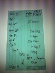
Retrospectives are the place for everyone to have their say on what’s working and what isn’t. But does everyone have their say? Who’s talking? Who’s not?
Sometimes it’s hard to tell who speaks and who gets drowned out. To get to the bottom of this, one of our team began mapping who spoke during the retro, almost as a doodle. It’s a simple idea which has been evolved by other members of the team as they had a go at it. The latest incarnation of the heat map shows who is interacting with who. The secret sauce here is empowerment. This mapping process started because Dan felt empowered to just do it, and each subsequent team member who evolved the map felt empowered to adapt and improve it.
When you can easily see who’s interacting and who’s not, you can see where the whole team is missing out on important contributions from some members, and we can ask why.

The Naughty Corner
Posted by fe in Lonely Planet on April 14, 2012
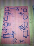
At Lonely Planet, it’s not just software development teams that use big visual indicators. In this hack, the guidebook commissioning team wanted to be very clear just what they were working on at any given time.

Here you can see what’s in pre-planning, currently being contracted, which books authors are researching and writing now, what’s in editing, at the printer and has just hit the shops. Also visible at a glance is what is blocked right now – there’s a special naughty corner for books that can’t be researched due to civil unrest. No authors in Libya right now!
I particularly like the little magnetic book covers that they use – visual language everyone involved in publishing can understand, and much more durable than paper and blue tack.
Thanks to Dave Carroll for this hack.
Spotted: LP Commissioning Editors
Who knows what?
Posted by fe in Lonely Planet, LP Content Desk, Telstra Contact Solutions on April 14, 2012
A self-serve training plan.
 The team that I work with runs a complex process involving many steps that require specialized knowledge for each step. Their aim is to have everyone skilled up on all the steps, and avoid single points of failure. It was pretty hard for team members to know who knew what, and we needed to be sure when Christmas holidays came along that the few people left knew enough to keep the process rolling.
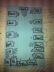
They came up with a visual to solve this. This grid lists all the steps in the process across the top, and all the members of the team down the side. A half circle means that person has learned the task, two half circles means that they know it well enough to teach someone else. And the little avatars across the top next to each step show who the expert is for that step – and therefore the best person to go to with questions.
As well as being a self-serve training plan – it’s easy to see what each person does and doesn’t know and therefore make sure they learn new steps – it also highlights areas of risk. In this picture we can see that the last step, with only one person knowing how to do it, shows up a pretty big risk if that person is away.
Below, you can see this “self serve university” at a massive scale. This time it covers more than 100 niche skills, and 80 people. The principle is the same: people can mark each skill with either “I know this skill”, “I want this skill” or “I can teach this skill”.

Spotted: SPP Content Desk, Telstra Contact Solutions
Making Sense of Tech Debt, Fast
Posted by nthorpe in If we tell you we'll have to kill you on April 10, 2012
Fabio Pereira uses this method to help teams quickly prioritise tech debt. In this example, the team held a Tech Debt retro where they brainstormed all the technical debt they thought they had accrued since the start of the project.
“Technical Debt” is postponed work created when a team takes some technical shortcuts in order to get a solution out fast. These shortcuts create a “debt which must be paid back later. It’s often hard to know where to start on addressing this “debt”.
The team then classified the debt on two axes this way:
“The relative effort that the team would have to spend in order to pay this debt.“
“Pain is the direct impact on productivity that this debt causes. (interest)”

This made it easy for them to decide what to tackle first. “Lets start on the high value work which takes the least effort”!

Fabio says: “One interesting thing that came out of our retro was that the High Return section was almost empty. We came to the conclusion that this was a good sign, it means that we had already fixed most of the LowEffort/HighPain debt during the normal development. Which is exactly how this type of debt should be paid.”