Posts Tagged Big Visual Indicators
Choosing a Continuous Improvement Focus with the Wheel of (Collaborative) Fortune
Posted by fe in Uncategorized on March 3, 2016
Ahhhh, Wheel of Fortune. How I loved that show when I was a kid. Was it the spinning of a giant wheel, or the chance of winning a fortune? The spinning of a giant wheel does have some child-like appeal. And it seems I’m not the only one that feels that way, because Nat Gorman, sent us this – his Wheel of Collaborative Project Procurement Arrangements.

Dr Derek Walker’s book, Collaborative Project Procurement Arrangements identifies 16 behaviours and practices that lead to greater collaboration and thus better outcomes for projects. Nat and his team use the wheel to provide a focus for some of their continuous improvement work.
We spin, then deep dive into one, then rate ourselves, others, teams, groups, departments, orgs … for that element at that time to form spider diagrams over time – project metrics generated each time we’re at the agile board/at a stand up…
This spinning mechanism itself looks like it required some serious hacking, but also could easily be repurposed to easily create other wheels.

Information gathering – a woolly solution
Posted by fe in Uncategorized on December 9, 2015
The best thing about a physical wall, in my mind, is the interactiveness of it. The easier it is to engage with something, the higher the collaboration, understanding, learning. So I was pretty interested when I saw this in street the other day. What was going on? What problem were they trying to solve with this?
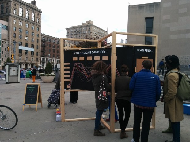
The local community had realised that despite having a lot of American Census data about their neighbourhood, there wasn’t any qualitative information gathered – things like how people perceive their community and how they want to see it. So they wanted to survey the community, and get data they could correlate with the census data. But they also wanted to overcome the problem of getting people to participate. They didn’t want another boring survey, they wanted something that was fun and easy to interact with.
They set up an intriguing information radiator outside the library, on a market morning. And it worked. There was no need to entice people to fill in surveys because people couldn’t help but stop to look. And then, they took a piece of wool and tied it to the pins that represented how they felt about their neighbourhood. The same kind of questions that you’d get on a standard survey, but much more fun to answer.
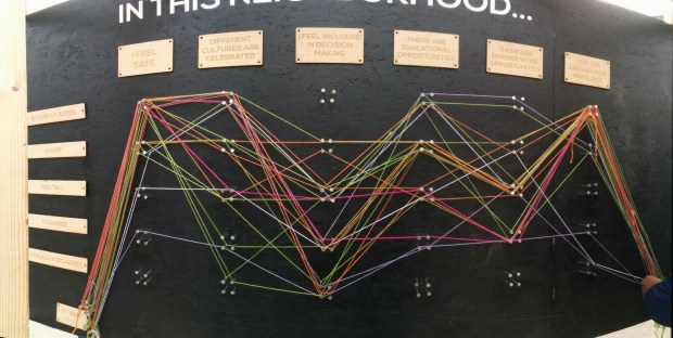
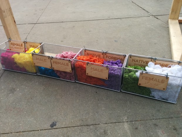
Different coloured wool represented different demographics within the neighbourhood. And they match the demographics from the American Census, so data can be correlated accordingly. (I got to tie on a white string).
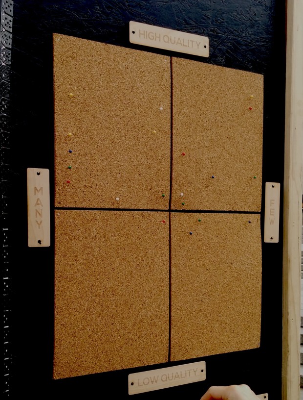
On the back of the board there were some more traditional activities going on – collecting suggestions on post-it notes as well as quadrant mapping feelings about various neighbourhood facilities.

It was a great reminder of how the physical and interactive can engage and delight, and of the importance of making it easy to interact with. I’m looking for a reason to use this at work soon…
For more information, see Community Census.
Lego Board
Posted by fe in If we tell you we'll have to kill you on August 28, 2015
This lego board serves a particular need by a team in a unique way – like all the best board hacks do.
This wall is used by a procurement team for a large organisation as a place for conversations about the status of various procurement projects. As well as the usual conversations around current status, blockers, progress, the team wanted to have visual indicators that would prompt them to have conversations about how long a project had been running, what stages of procurement it had already been through, etc.

Prototyping to learn
The team started by quickly building a prototype wall using index cards with mail-merge stickers on them describing each procurement project. This information had previously lived in a spreadsheet. With the work quickly thrown up onto a wall, they asked themselves the question: “What is this wall not telling me?”.
Answer: a lot! There were so many cards it was hard to see what was going on. They were hard to read. And the wall couldn’t tell the team anything about cycle time: how long was each project taking to go through the whole procurement process?
Additionally, one of the team members had a visual disability, so the team wanted something with high contrast and large lettering. This was going to be hard to achieve with cards, given the number of procurement projects which were in flight at any time.
With this learning, the team built a second board, this time from Lego.
The board now
The left hand side of the wall is fairly familiar – a line for each project, with columns for portfolio (coded by colour), category and status, as well as the cost of the project. It’s over on the right that the fun begins. The grey lego base board is divided horizontally into sections for each team member – who is limited to no more than 7 projects on the go and has their own little lego avatar and a “one brick” row 2 lugs high for each project. Vertically, the board is divided into weeks.

Team members get their own minifigs and each is limited to 7 lines and therefore 7 projects.
Each project is tracked using a lego brick. The size of brick indicates expected length of delivery of the project and the colour indicates the procurement stage that the project is currently in.

Brick colour represents process steps. Brick size represents T-shirt – size estimates.
At the beginning of each stage of procurement, a project’s lego brick starts in week 1 and progresses on from there. At the end of each stage, the number of weeks spent is recorded on the edge of the brick using a sharpie, the appropriate colour brick for the next stage of the procurement process is stacked on top of the previous, and the stack of bricks goes back to week 1.
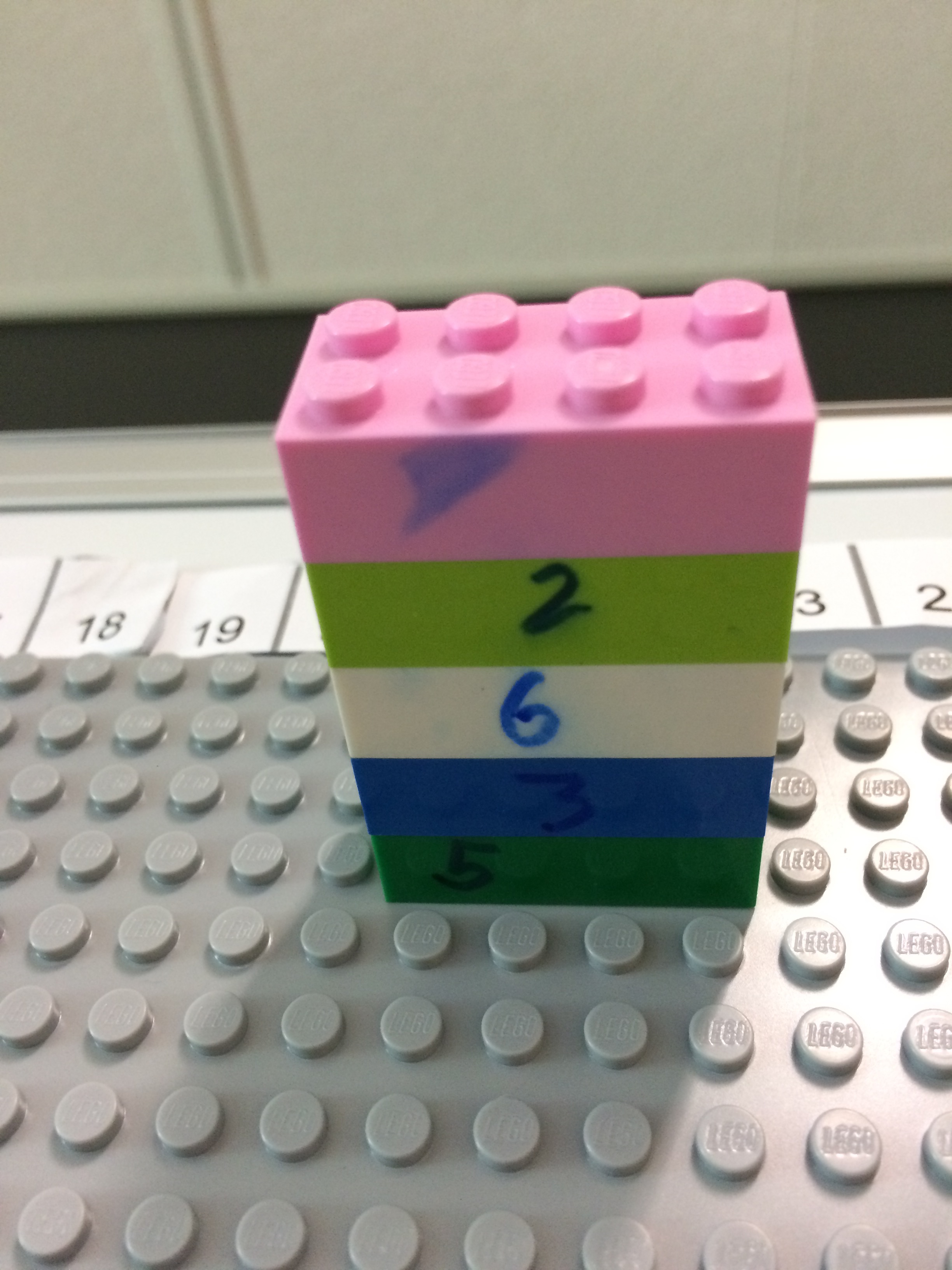
Each lego layer shows cycle time for a stage of the procurement process in weeks, together making up the whole project.

Team members can read weeks of cycle time for each project off the scale at the top.
So it’s easy to see:
- how long a project has been in it’s current stage according to the week column it is in;
- the stages it has already been through by the different coloured bricks in it’s stack – not every project uses all steps, so it’s easy to see, for example, when a project hasn’t gone out for RFP as there will be no white brick in it’s stack);
- which stage any given job is at by the top coloured brick;
- whether it has been longer than planned in a stage – for example a medium-sized brick shouldn’t be sitting out at week 14; and
- how long in total it’s been on the go by quickly adding the numbers on the sides of the bricks.

Worst Jobs in History: Who sits where?
Posted by nthorpe in If we tell you we'll have to kill you, Uncategorized on April 9, 2015
Here’s a candidate for the worst job in history. Put your hand up to be the one who figures out who sits where in an office, when there is a move or a restructure on. An endless cycle of creating spreadsheets, consulting with people, updating spreadsheets, consulting again. And no one is allowed to see it until it’s final for fear that they complain. What a nightmare.
But my friend Nat has it figured out. The ultimate transparency in seating plans. Instead of the endless rounds of secret consultations, and paper updating, he creates a place for conversation and thinking about who is going to sit where. On his filing cabinet, he sticks up a seating chart and uses people-shaped memo magnets, colour-coded further with liquid paper and highlighters to represent different teams:

Each team can see where they are sitting, and can try out different combinations with Nat. “What if we did this?…”

It’s easy to update and change, you never have to worry about accidentally deleting someone (you can’t lose these magnets, they are so strong that if they are anywhere near the filing cabinet they will home in like an exocet missile), and if you need a soft-copy – just snap a picture.
(But what if you don’t have a handy filing cabinet? Aussiemagnets.com.au also stock a range of flexible iron products that can make a magnetic surface where there is none. Want to use magnetic cards but you have a glass wall? You can attach flexible iron to the walls with double-sided tape, and the whole area is magnet-friendly.)
Spotted: If we tell you we’ll have to kill you.
Dependency mapping
Posted by fe in Telstra Contact Solutions on April 20, 2013
An Agile world without dependencies would be a wonderful place. Each piece of work could be executed independently of any other, in any order. In a perfect world it all works out just like this. 😛
But much as we would like it to be, it’s not always like that. Dependencies are real. For example: hardware might be required to provide the value the end-customer wants. And until it’s in place – either for development, or testing, or production – you just can’t create that value. Dependencies are especially common in large, distributed pieces of work where one team will depend on the work of another. Ignore them at your peril.
The board below is one of those situations. A large program of work spread across multiple teams, with dependencies between teams. Caleche Watson, the project manager on this team has mapped out the dependency using a piece of string, so its clear where it lies.
A piece of string shows the dependency between two pieces of work.

Teams which depend on each other need to talk a lot to keep in sync and ensure the best outcome overall. This piece of string makes obvious a conversation that needs to happen at their regular joint stand up. As Caleche said:
“At the end of the piece of string is a conversation”.
Spotted: Telstra Contact Solutions
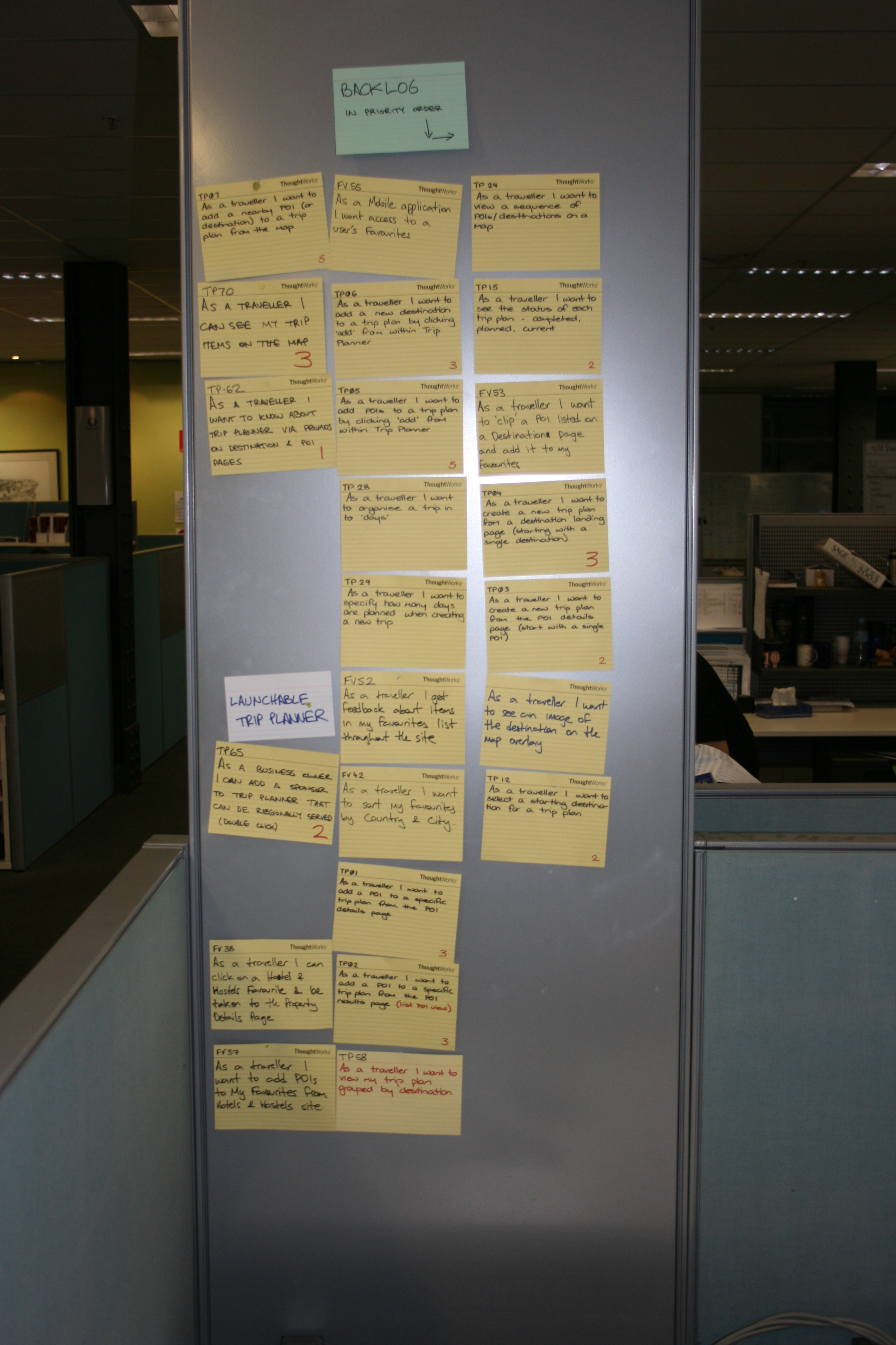
Feature Burnup Charts are on the Cards
Posted by nthorpe in Telstra Contact Solutions on April 17, 2013
When agile is working at scale, with multiple teams, there is usually a need to see progress through the work at different “zoom-levels”.
Most familiar is the story zoom-level: How are the stories progressing? Are they blocked? Why? How is the iteration progressing? Team boards, and team level hacks, help us to see these things change, and to understand how to improve.
At a higher zoom-level, the visibility needed is: How are multiple teams progressing through the larger pieces of work (we’ll call them features) which the stories are part of. So what we need to see is: When are they likely to finish this feature? What’s at risk? What’s blocking the team? Does the team need help?
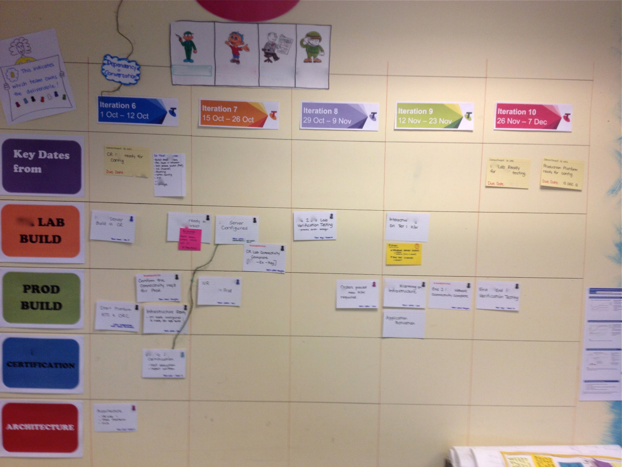
This level of information is often represented on a program wall, which is a bit like a “zoomed-out” version of a team wall, showing the backlog of features to be delivered, cycle time across the whole program, and so on.
Here’s an example of a program wall. Each team is represented by a horizontal row and the columns are the iterations in which the teams expect each feature to finish.

The program wall shows all the features in progress.
The detail of how these features are tracking is found on the individual teams walls. But one team found a way to clearly summarise their progress on this wall too. They decided to stick burnups onto the front of each feature card. (A burnup is one of the most eloquent of board hacks as it provides a single view of scope and velocity, as both change).

Burnups on each feature card show the team’s progress through that feature, as well as changes in scope.
You can see it a little better below:

So now, when you’re standing at the feature wall you can see the burnup for that feature, right on the front of the feature card without having to go and find the team wall. In this example, the feature is in the Iteration 12 column, but the burnup tells me it’s more likely to finish in the 14th iteration unless something changes – I smell risk! You can get a very rich sense of what’s going on, at a glance.
Spotted: Telstra Contact Solutions
Opportunistic Boards
Posted by nthorpe in Bankwest, Perth, Lonely Planet, Medibank on March 13, 2013
Sometimes you just don’t have wall space. You may be at the mercy of the building police, who sternly forbid such outrageous acts as using blu-tac on a blank wall to boost productivity – or you may just be somewhere that doesn’t have walls, and you need to think and plan.
What do you do? You get opportunistic.
Here’s a few innovative boards we’ve seen around the traps:
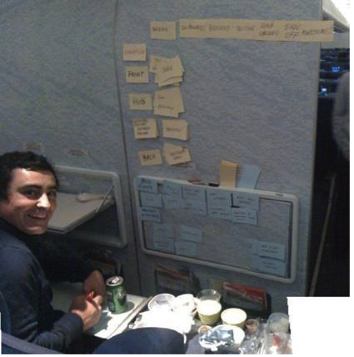
Mark and Gus, at 40,000 feet, on an A380 Airliner:
Agilistas in an activity-based-workspace, who improvised with a shower curtain:

Spotted: Bankwest, Perth
Use a pole:
Spotted: Lonely Planet
Use a window:

Spotted: Medibank
Horizontal board on a desk (we weren’t allowed to put anything on the walls) – with half-sized cards.

spotted: If we tell you, we’ll have to kill you
What have you seen used as a board?
Shower Curtain Aids Transparency
Posted by nthorpe in Bankwest, Perth, In the Agilista's Backpack on March 5, 2013
No, it’s not for planning your iteration in the shower. Sorry.
Sometimes, you just can’t get to the walls. Maybe the building police won’t let you put anything on the walls. Maybe there just isn’t the space, or your team isn’t located adjacent to a wall. Portable whiteboards, which are the usual guerilla weapon of choice in this situation, can block lines of sight and available light. And sometimes they get the building police excited, too.
One team decided to take matters into their own hands and create their own Shower Scene. The cards fit into little pockets designed into the shower curtain. Note the little suckers at the top which allow you to stick it up on any smooth surface.
Just one supplier for this product (shop around, people, and let us know where the bargains are!).
Spotted: Bankwest, Perth
Whiteboard Paint
Posted by nthorpe in In the Agilista's Backpack, Lonely Planet SPP Dev Team on March 5, 2013
Turn any wall into a whiteboard! This stuff is the bomb.
I haven’t used this brand before, but there are a few variants on the market. Once you get over your fear of writing directly on the wall, being able to write anywhere is very liberating.
At Lonely Planet, there was a team war-room where all the walls were painted with whiteboard paint. The kind we had wrote well, and erased well too. For a while, we had an entire business case sketched up on the wall and stakeholders could come and talk through the whole thing. We could change the slides right there on the wall, on the fly. A great place for thinking. Look out though, your wall is going to look like this in no time!
Here is another brand.
Special props to Nigel Dalton and Gus Balbontin on this one.
Are you sleeping?
Posted by fe in If we tell you we'll have to kill you on March 2, 2013

Here are some interesting facts* about (lack of) sleep that you may not know:
- seventeen hours of sustained wakefulness leads to a decrease in performance equivalent to a blood alcohol-level of 0.05%.
- a new baby typically results in 400-750 hours lost sleep for parents in the first year.
- it’s impossible to tell if someone is really awake without close medical supervision. People can take cat naps with their eyes open without even being aware of it.
How does that affect you at work? My mate Dave knew it affected him badly, so he came up with this visual hack to let people know how he was feeling. He says:
“We’d just had Hamish, and were in the sleeplessness death zone a lot of the time. But at work we were in the crucial months of getting data ready for a new site, and I was the go-to guy for a whole bunch of content things. Some days I was capable of rational thought and decision-making; others, not so much. So this meter helped give people a kind of reliability quotient for anything I said that day.”
Thanks to David Burnett for this hack.
*Source: The National Sleep Research Project via abc.net.au

