Archive for category Telstra Contact Solutions
Dependency mapping
Posted by fe in Telstra Contact Solutions on April 20, 2013
An Agile world without dependencies would be a wonderful place. Each piece of work could be executed independently of any other, in any order. In a perfect world it all works out just like this. 😛
But much as we would like it to be, it’s not always like that. Dependencies are real. For example: hardware might be required to provide the value the end-customer wants. And until it’s in place – either for development, or testing, or production – you just can’t create that value. Dependencies are especially common in large, distributed pieces of work where one team will depend on the work of another. Ignore them at your peril.
The board below is one of those situations. A large program of work spread across multiple teams, with dependencies between teams. Caleche Watson, the project manager on this team has mapped out the dependency using a piece of string, so its clear where it lies.
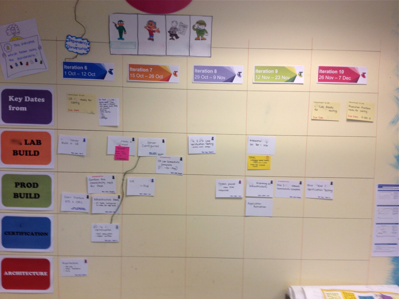
A piece of string shows the dependency between two pieces of work.

Teams which depend on each other need to talk a lot to keep in sync and ensure the best outcome overall. This piece of string makes obvious a conversation that needs to happen at their regular joint stand up. As Caleche said:
“At the end of the piece of string is a conversation”.
Spotted: Telstra Contact Solutions
Feature Burnup Charts are on the Cards
Posted by nthorpe in Telstra Contact Solutions on April 17, 2013
When agile is working at scale, with multiple teams, there is usually a need to see progress through the work at different “zoom-levels”.
Most familiar is the story zoom-level: How are the stories progressing? Are they blocked? Why? How is the iteration progressing? Team boards, and team level hacks, help us to see these things change, and to understand how to improve.
At a higher zoom-level, the visibility needed is: How are multiple teams progressing through the larger pieces of work (we’ll call them features) which the stories are part of. So what we need to see is: When are they likely to finish this feature? What’s at risk? What’s blocking the team? Does the team need help?
This level of information is often represented on a program wall, which is a bit like a “zoomed-out” version of a team wall, showing the backlog of features to be delivered, cycle time across the whole program, and so on.
Here’s an example of a program wall. Each team is represented by a horizontal row and the columns are the iterations in which the teams expect each feature to finish.

The program wall shows all the features in progress.
The detail of how these features are tracking is found on the individual teams walls. But one team found a way to clearly summarise their progress on this wall too. They decided to stick burnups onto the front of each feature card. (A burnup is one of the most eloquent of board hacks as it provides a single view of scope and velocity, as both change).

Burnups on each feature card show the team’s progress through that feature, as well as changes in scope.
You can see it a little better below:

So now, when you’re standing at the feature wall you can see the burnup for that feature, right on the front of the feature card without having to go and find the team wall. In this example, the feature is in the Iteration 12 column, but the burnup tells me it’s more likely to finish in the 14th iteration unless something changes – I smell risk! You can get a very rich sense of what’s going on, at a glance.
Spotted: Telstra Contact Solutions
Who knows what?
Posted by fe in Lonely Planet, LP Content Desk, Telstra Contact Solutions on April 14, 2012
A self-serve training plan.
 The team that I work with runs a complex process involving many steps that require specialized knowledge for each step. Their aim is to have everyone skilled up on all the steps, and avoid single points of failure. It was pretty hard for team members to know who knew what, and we needed to be sure when Christmas holidays came along that the few people left knew enough to keep the process rolling.
They came up with a visual to solve this. This grid lists all the steps in the process across the top, and all the members of the team down the side. A half circle means that person has learned the task, two half circles means that they know it well enough to teach someone else. And the little avatars across the top next to each step show who the expert is for that step – and therefore the best person to go to with questions.
As well as being a self-serve training plan – it’s easy to see what each person does and doesn’t know and therefore make sure they learn new steps – it also highlights areas of risk. In this picture we can see that the last step, with only one person knowing how to do it, shows up a pretty big risk if that person is away.
Below, you can see this “self serve university” at a massive scale. This time it covers more than 100 niche skills, and 80 people. The principle is the same: people can mark each skill with either “I know this skill”, “I want this skill” or “I can teach this skill”.

Spotted: SPP Content Desk, Telstra Contact Solutions
-
You are currently browsing the archives for the Telstra Contact Solutions category.