Archive for category If we tell you we’ll have to kill you
Lego Board
Posted by fe in If we tell you we'll have to kill you on August 28, 2015
This lego board serves a particular need by a team in a unique way – like all the best board hacks do.
This wall is used by a procurement team for a large organisation as a place for conversations about the status of various procurement projects. As well as the usual conversations around current status, blockers, progress, the team wanted to have visual indicators that would prompt them to have conversations about how long a project had been running, what stages of procurement it had already been through, etc.

Prototyping to learn
The team started by quickly building a prototype wall using index cards with mail-merge stickers on them describing each procurement project. This information had previously lived in a spreadsheet. With the work quickly thrown up onto a wall, they asked themselves the question: “What is this wall not telling me?”.
Answer: a lot! There were so many cards it was hard to see what was going on. They were hard to read. And the wall couldn’t tell the team anything about cycle time: how long was each project taking to go through the whole procurement process?
Additionally, one of the team members had a visual disability, so the team wanted something with high contrast and large lettering. This was going to be hard to achieve with cards, given the number of procurement projects which were in flight at any time.
With this learning, the team built a second board, this time from Lego.
The board now
The left hand side of the wall is fairly familiar – a line for each project, with columns for portfolio (coded by colour), category and status, as well as the cost of the project. It’s over on the right that the fun begins. The grey lego base board is divided horizontally into sections for each team member – who is limited to no more than 7 projects on the go and has their own little lego avatar and a “one brick” row 2 lugs high for each project. Vertically, the board is divided into weeks.

Team members get their own minifigs and each is limited to 7 lines and therefore 7 projects.
Each project is tracked using a lego brick. The size of brick indicates expected length of delivery of the project and the colour indicates the procurement stage that the project is currently in.

Brick colour represents process steps. Brick size represents T-shirt – size estimates.
At the beginning of each stage of procurement, a project’s lego brick starts in week 1 and progresses on from there. At the end of each stage, the number of weeks spent is recorded on the edge of the brick using a sharpie, the appropriate colour brick for the next stage of the procurement process is stacked on top of the previous, and the stack of bricks goes back to week 1.
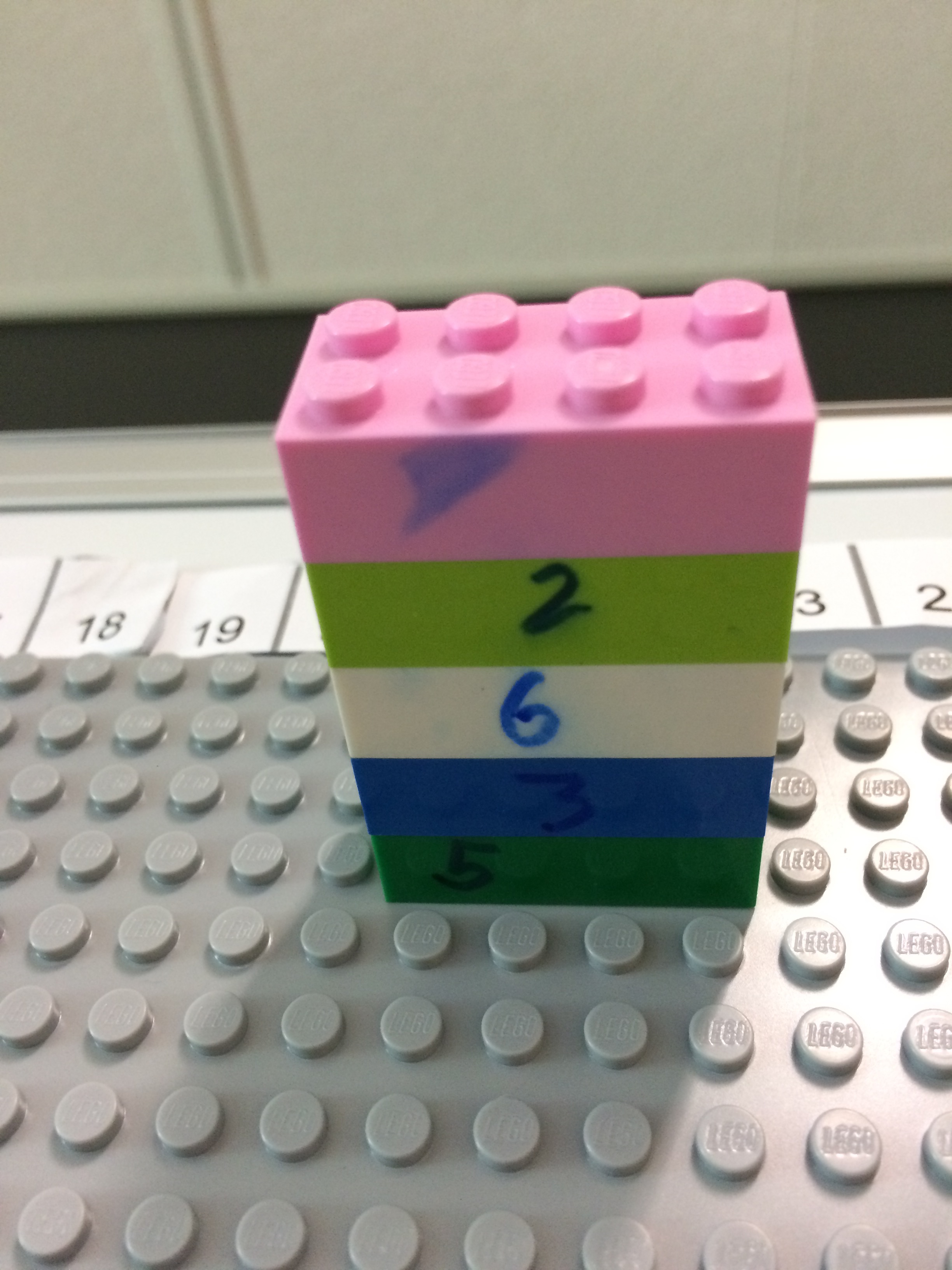
Each lego layer shows cycle time for a stage of the procurement process in weeks, together making up the whole project.

Team members can read weeks of cycle time for each project off the scale at the top.
So it’s easy to see:
- how long a project has been in it’s current stage according to the week column it is in;
- the stages it has already been through by the different coloured bricks in it’s stack – not every project uses all steps, so it’s easy to see, for example, when a project hasn’t gone out for RFP as there will be no white brick in it’s stack);
- which stage any given job is at by the top coloured brick;
- whether it has been longer than planned in a stage – for example a medium-sized brick shouldn’t be sitting out at week 14; and
- how long in total it’s been on the go by quickly adding the numbers on the sides of the bricks.

Worst Jobs in History: Who sits where?
Posted by nthorpe in If we tell you we'll have to kill you, Uncategorized on April 9, 2015
Here’s a candidate for the worst job in history. Put your hand up to be the one who figures out who sits where in an office, when there is a move or a restructure on. An endless cycle of creating spreadsheets, consulting with people, updating spreadsheets, consulting again. And no one is allowed to see it until it’s final for fear that they complain. What a nightmare.
But my friend Nat has it figured out. The ultimate transparency in seating plans. Instead of the endless rounds of secret consultations, and paper updating, he creates a place for conversation and thinking about who is going to sit where. On his filing cabinet, he sticks up a seating chart and uses people-shaped memo magnets, colour-coded further with liquid paper and highlighters to represent different teams:

Each team can see where they are sitting, and can try out different combinations with Nat. “What if we did this?…”

It’s easy to update and change, you never have to worry about accidentally deleting someone (you can’t lose these magnets, they are so strong that if they are anywhere near the filing cabinet they will home in like an exocet missile), and if you need a soft-copy – just snap a picture.
(But what if you don’t have a handy filing cabinet? Aussiemagnets.com.au also stock a range of flexible iron products that can make a magnetic surface where there is none. Want to use magnetic cards but you have a glass wall? You can attach flexible iron to the walls with double-sided tape, and the whole area is magnet-friendly.)
Spotted: If we tell you we’ll have to kill you.
A wall with a view
Posted by fe in If we tell you we'll have to kill you on June 13, 2013
As we’ve mentioned before, sometimes you just have to work with the reality that you are not allowed to stick anything on the walls – especially when your walls are the glass of an office building.
A team I’ve been working with recently knew that they needed to come up with a solution to comply and respect their building policy – however the only space was the glass. A policy common in many buildings. However they didn’t let that hold them back! After a couple of weeks they had a feel for how much space they were using, so they designed their own walls. As well as being portable, they also had to let light through so that they weren’t blocking out the natural light. Their innovative solution was clear perspex agile boards – and they are one of the slickest solutions that I’ve seen.

Ironically, they are almost too good. From a distance the perspex agile boards blend into the building windows. Many people do a double take when they realise they’re not on the windows at all!
Spotted: If we tell you we’ll have to kill you
Are you sleeping?
Posted by fe in If we tell you we'll have to kill you on March 2, 2013

Here are some interesting facts* about (lack of) sleep that you may not know:
- seventeen hours of sustained wakefulness leads to a decrease in performance equivalent to a blood alcohol-level of 0.05%.
- a new baby typically results in 400-750 hours lost sleep for parents in the first year.
- it’s impossible to tell if someone is really awake without close medical supervision. People can take cat naps with their eyes open without even being aware of it.
How does that affect you at work? My mate Dave knew it affected him badly, so he came up with this visual hack to let people know how he was feeling. He says:
“We’d just had Hamish, and were in the sleeplessness death zone a lot of the time. But at work we were in the crucial months of getting data ready for a new site, and I was the go-to guy for a whole bunch of content things. Some days I was capable of rational thought and decision-making; others, not so much. So this meter helped give people a kind of reliability quotient for anything I said that day.”
Thanks to David Burnett for this hack.
*Source: The National Sleep Research Project via abc.net.au
A fresh set of eyes…
Posted by fe in If we tell you we'll have to kill you, Uncategorized on September 10, 2012
After spending a day with a new team setting up their first agile wall, I was surprised to come back the next week and see a pair of binoculars on one of their desks. When I asked about them it turned out that one of the team was using them to read the board without having to get up from his desk.
Brilliant! Why have I never thought of doing this???? I just squint at the board or walk back and forth from my desk.
Of course, a fresh set of eyes will always come up with a new way of doing things. What could do with a fresh set of eyes in your team?

CC image courtesy of drtel on Flickr
Making Sense of Tech Debt, Fast
Posted by nthorpe in If we tell you we'll have to kill you on April 10, 2012
Fabio Pereira uses this method to help teams quickly prioritise tech debt. In this example, the team held a Tech Debt retro where they brainstormed all the technical debt they thought they had accrued since the start of the project.
“Technical Debt” is postponed work created when a team takes some technical shortcuts in order to get a solution out fast. These shortcuts create a “debt which must be paid back later. It’s often hard to know where to start on addressing this “debt”.
The team then classified the debt on two axes this way:
“The relative effort that the team would have to spend in order to pay this debt.“
“Pain is the direct impact on productivity that this debt causes. (interest)”

This made it easy for them to decide what to tackle first. “Lets start on the high value work which takes the least effort”!

Fabio says: “One interesting thing that came out of our retro was that the High Return section was almost empty. We came to the conclusion that this was a good sign, it means that we had already fixed most of the LowEffort/HighPain debt during the normal development. Which is exactly how this type of debt should be paid.”
Release Radar helps you see through the fog
Posted by nthorpe in If we tell you we'll have to kill you on February 10, 2012
 A common or garden Agile board is good for a view of the iteration you’re in, and perhaps a little further out. But what about when you need to see even further? Agile teams often face the problem of “boiling priorities”. Priority changing on big pieces of work daily. You start to work on them, and then you hear they have been de-prioritised. It’s hard to know what you should be working on. The team can churn through a lot of brain cycles thinking about pieces of work which may or may not eventuate. This can be stressful.
Sometimes we need to be vaguely aware of pieces of work which are “out there” in the future, whilst still keeping our focus squarely on what we know is coming next. Different roles in the team, too, have different time horizons they need to care about. For Project Managers, or Business Analysts who need to organise and run inception activity, it’s good practice to keep an eye on what’s coming down the pipe. For developers, it’s often: “Meh. Just tell me what I need to do next.”
Daniel Aragao showed us a great way to deal with frothing priorities – the release radar.
Here he has trained his radar across the portfolio:
– each concentric circle represents time (12,9,6,3,1 and .5 month). Items far out on the radar are distant in time, items nearer the centre are closer in time
– each slice is a project, identified by a post-it on the outer rim
– resources working on the project are also on the outer rim – these will be avatars in the future
– each post-it represents a task, module, something that is big enough to be picked up by the radar
– post-its will be colour-coded to show the size of each task. T-Shirt sizes (S-green,M-yellow,L-orange,XL-red)
– IT, Ops and Business get together every 2 weeks to update the Radar and discuss associated risks
On our team, we took the idea and adapted it to our needs. Our radar simply tracks pieces of work as they orbit our world, and then come in to land.

The purpose was to be able to provide steady priorities to the team (they only need to look at the innermost ring), to help our BA structure her work with stakeholders on preparing epics, and to get a view of the whole pipeline if we needed it. We keep it on the back of the iteration board, and a subset of the team meet once a fortnight to update it. It tells us what we need to actively think about, and what we can ignore.
The quadrants relate to stakeholders.

Spotted: Daniel Aragao of Thoughtworks shared this idea.
Revenue on a Card
Posted by nthorpe in If we tell you we'll have to kill you on July 3, 2011

Sometimes it feels like the agile community knows the cost of everything, and the value of nothing. We have clever ways to measure velocity and to estimate the size (and therefore cost) of pieces of work, and we like to obsess over these. But when do we ever quantify the value which will be delivered by a piece of work? Relative value is taken into account when a product owner prioritises higher value stories in the backlog, and some methodologies do take a shot at quantifying business value nowadays, but I don’t see much evidence of teams trying to quantify the value of a piece of work either before, or after it is delivered.
Deming says “Plan, Do, Check, Act“. But most of the time it just feels like “Plan, Do, Plan Do, Plan Do”.
I salute this team which puts the revenue at stake right on the card for everyone to see. If this is job is blocked for a day – is it a big deal, or not? Look at the revenue at stake. It’s a big deal.
Spotted: anonymous
-
You are currently browsing the archives for the If we tell you we’ll have to kill you category.