Slickynotes look like they are worth a try
Posted by nthorpe in In the Agilista's Backpack on November 27, 2014
Index Cards and Post-its. Whiteboards. These are our utensils. We spend our days with them. We write on them, stick em on walls, we photograph them. We write them up. Hundreds of them. I spend so much time with them that they even invade my dreams. I think if I see those 5 pukey index card colours for another year though, I’m going to have to kill someone. Ergh.
Hello, Slickynotes.

Slickynotes are reusable, 2 sided, and adhere by static cling.
Slickynotes stick to smooth surfaces by static electricity. I tried them on glass and painted walls and they seem to stick about as well as post-its. They don’t have adhesive on them which means that they are usable on both sides. As an added bonus, one side is erasable if you use whiteboard markers, much like a whiteboard or those flexible magnetic index cards. Another bonus is that these are re-usable – we do generate a lot of waste with all our post-its.
Slickynotes come in two sizes – the smallish ones are 100mm x 74mm, and the medium-sized ones are 200mm by 100mm.
I have some of these, and I’ve played with them, but I haven’t had a chance to try them out in a real life work setting yet. A colleague swears by them though so I think they are worth a try.
Lego Calendar
Posted by nthorpe in Uncategorized on October 26, 2014
Lean Coffee?
Posted by nthorpe in Uncategorized on September 4, 2014
You know how Melbournites can get about our coffee – if you dis my macchiato dealer, you’ll get into a stoush faster than you can say “Carlton sucks”.
One of my locals is the Postal Hall. I was intrigued recently by the particular visual dialect they use to make their tasks and queues visible. Look at the pictures below:

This is a queue. And the arrangement of spoons, bottle caps and milk jugs are the visual language.
The first cup in the queue is a flat white (milk jug) for the outside right table (see bottle cap), with one sugar (1 spoon). And it’s followed up by a cafe latte with two sugars for the same table.
If customers have a special requirement, this is signalled with the use of an ice cream stick: “smokin hot”!
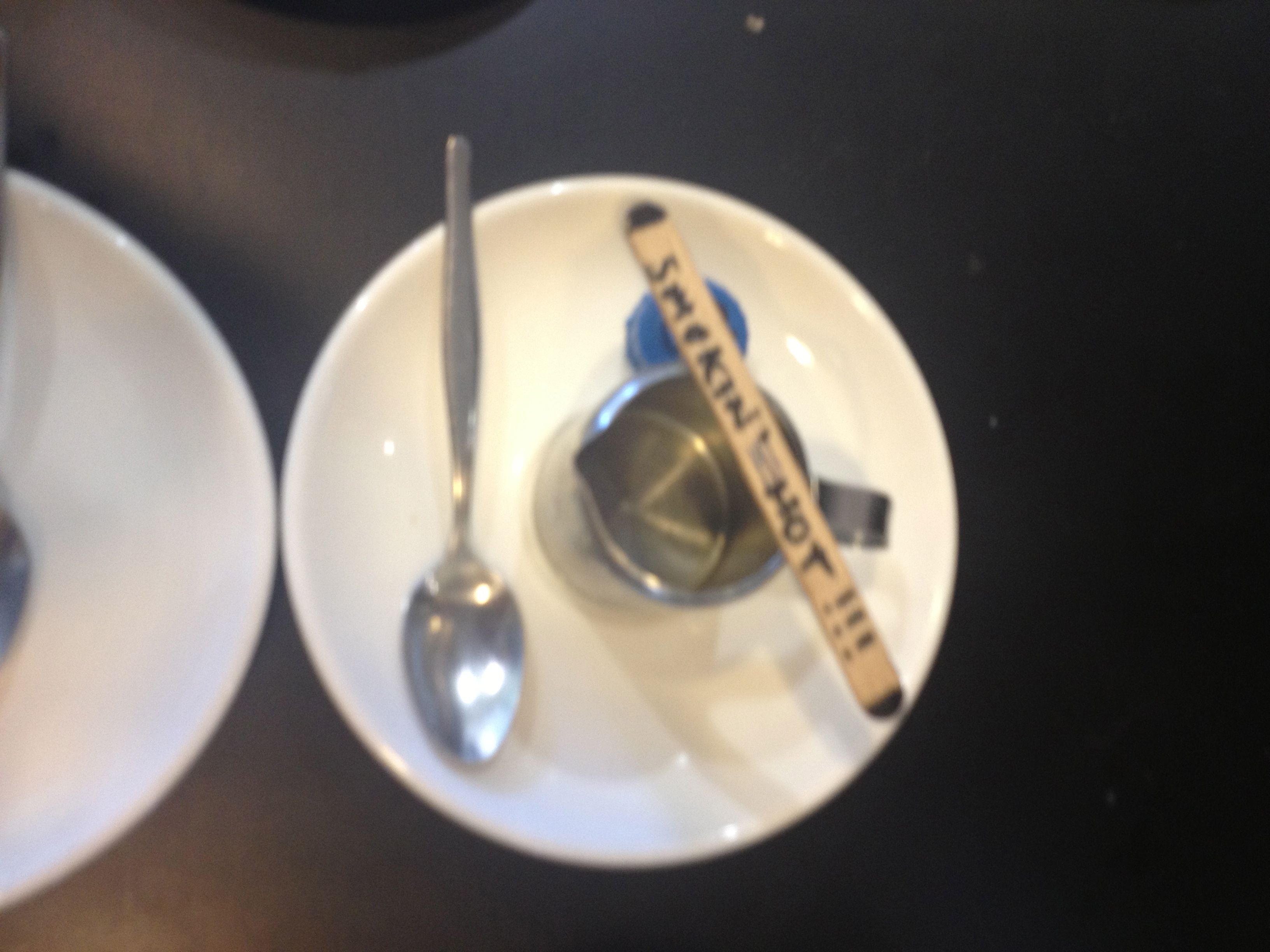
The waitstaff bring the jobs in and set them up, and the barista creates the brew. No need to read a list, a quick glance at the setup tells the barista all he needs to know.
Next up, WIP queue limits?
For another example of lean in the fast food industry, see Nigel Dalton‘s classic post here.
We’d love to hear of other examples. Seen any lately?
Spotted: Postal Hall, 116 Russell St, Melbourne.
Blocks of Time
Posted by nthorpe in Uncategorized on September 4, 2014
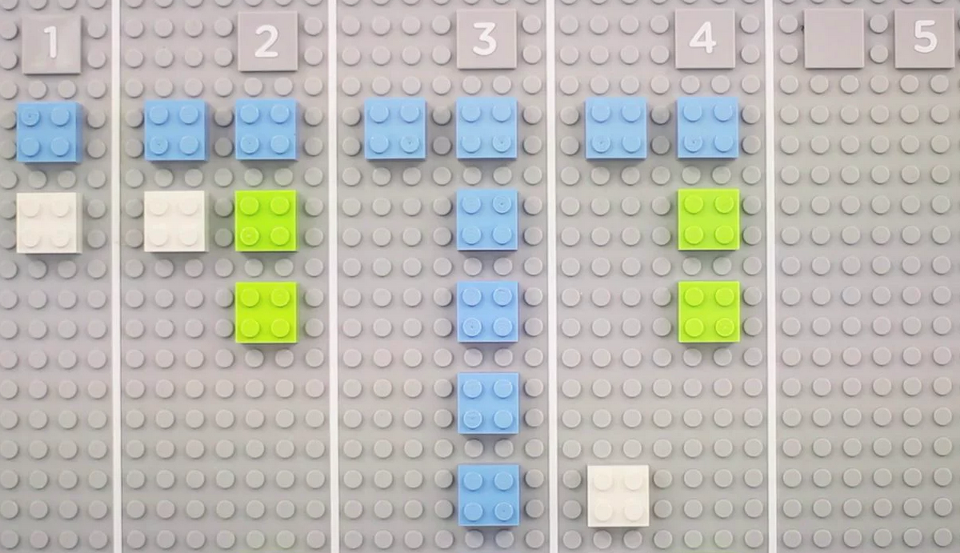
Trying to keep track of time spent on different tasks. Or clients. Or projects. Maybe you have had this problem. I know I have. You want to do it easily as you go. We all hate timesheets, and trying to remember what we did all day. Imagine if it easy. Imagine if it was fun!
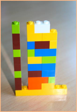
If you’re a consultant, you need it for billing purposes. If you’re not, your boss, or your timesheet might require it – or you might just be interested in understanding your work. Michael Hunger had this problem, and he created this 3D hack to solve it:
Michael Hunger’s week, represented in Lego.
Here’s how it works.
Right there, that’s Michael’s week. Each row of bricks represents an hour, and each tower is a day. As he goes through his day, he uses the coloured blocks to represent the project he’s working on (the box of lego came with 8 colours, and he figures thats enough to cover his projects). As he goes hour by hour, he adds the coloured bricks to the row for that hour. And builds up his day. The sizes of the bricks allow Michael to track in 15 minute increments, which should be enough.
When he’s building his day tower, he has a single unit lego “day” ruler next to it, to remind him how high 8 hours is. For him, thats his 10am to 6pm day. You can see this below:
Read the full details about this hack on Michael’s excellent blog, Better Software Development.
Hacking Trello
Posted by fe in Uncategorized on September 4, 2014
In my experience, digital card walls don’t really cut it. For me, they can’t compete with the tactility of the real thing – I just don’t get the same kinesthetic feedback when I move a card on a digital board. However, they are a reality of working life for many teams and I’m pretty excited to post our first Digital board hack here!
One of our readers works in a team who’d struck just this problem. A restructure meant that they were suddenly working with remote teams and their trusty cardboard and sharpie system didn’t cut it anymore. One of the things that didn’t easily transition over was the system of icons that they used to indicate things such as Blocked, Kicked Off, Bug. You know, those ones we have such fun printing, cutting, laminating and sticking on the front of cards to tell us all kinds of useful stuff.
The solution is actually pretty simple. Set up dummy users in Trello and give them profile pics that represent Blocked, Bug, etc. Add them as ‘members’ to cards and therefore see the “blocked” icon badge on it. As Dave tells it:
“[We] set up dummy email accounts associated with icons in gravatar.com. Then we could add them as members to our Trello board and use the icons as status stickers for our cards. [We gave them] all the same prefix as board member names (“z_blocked”, “z_kicked_off”, “z_walked_through”) [so that] these icon accounts are all … together in any listing.”
Great idea!
![]()
A wall with a view
Posted by fe in If we tell you we'll have to kill you on June 13, 2013
As we’ve mentioned before, sometimes you just have to work with the reality that you are not allowed to stick anything on the walls – especially when your walls are the glass of an office building.
A team I’ve been working with recently knew that they needed to come up with a solution to comply and respect their building policy – however the only space was the glass. A policy common in many buildings. However they didn’t let that hold them back! After a couple of weeks they had a feel for how much space they were using, so they designed their own walls. As well as being portable, they also had to let light through so that they weren’t blocking out the natural light. Their innovative solution was clear perspex agile boards – and they are one of the slickest solutions that I’ve seen.

Ironically, they are almost too good. From a distance the perspex agile boards blend into the building windows. Many people do a double take when they realise they’re not on the windows at all!
Spotted: If we tell you we’ll have to kill you
Agile Board Hacks Visualised
Posted by fe in Other Random Hacks on June 9, 2013
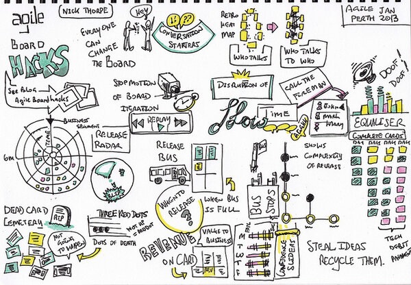
Okay, so this isn’t actually a hack. But it’s too beautiful not to include on the blog!
In January Nick was special guest speaker at the Agile Perth Meetup. Check out this visualisation that Gary Barber (@tuna) created while Nick spoke. We think it captures the spirit of Agile Board Hacks perfectly!
Dependency mapping
Posted by fe in Telstra Contact Solutions on April 20, 2013
An Agile world without dependencies would be a wonderful place. Each piece of work could be executed independently of any other, in any order. In a perfect world it all works out just like this. 😛
But much as we would like it to be, it’s not always like that. Dependencies are real. For example: hardware might be required to provide the value the end-customer wants. And until it’s in place – either for development, or testing, or production – you just can’t create that value. Dependencies are especially common in large, distributed pieces of work where one team will depend on the work of another. Ignore them at your peril.
The board below is one of those situations. A large program of work spread across multiple teams, with dependencies between teams. Caleche Watson, the project manager on this team has mapped out the dependency using a piece of string, so its clear where it lies.
A piece of string shows the dependency between two pieces of work.

Teams which depend on each other need to talk a lot to keep in sync and ensure the best outcome overall. This piece of string makes obvious a conversation that needs to happen at their regular joint stand up. As Caleche said:
“At the end of the piece of string is a conversation”.
Spotted: Telstra Contact Solutions
Feature Burnup Charts are on the Cards
Posted by nthorpe in Telstra Contact Solutions on April 17, 2013
When agile is working at scale, with multiple teams, there is usually a need to see progress through the work at different “zoom-levels”.
Most familiar is the story zoom-level: How are the stories progressing? Are they blocked? Why? How is the iteration progressing? Team boards, and team level hacks, help us to see these things change, and to understand how to improve.
At a higher zoom-level, the visibility needed is: How are multiple teams progressing through the larger pieces of work (we’ll call them features) which the stories are part of. So what we need to see is: When are they likely to finish this feature? What’s at risk? What’s blocking the team? Does the team need help?
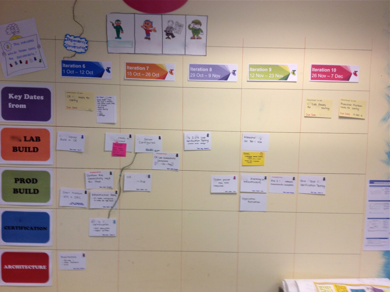
This level of information is often represented on a program wall, which is a bit like a “zoomed-out” version of a team wall, showing the backlog of features to be delivered, cycle time across the whole program, and so on.
Here’s an example of a program wall. Each team is represented by a horizontal row and the columns are the iterations in which the teams expect each feature to finish.

The program wall shows all the features in progress.
The detail of how these features are tracking is found on the individual teams walls. But one team found a way to clearly summarise their progress on this wall too. They decided to stick burnups onto the front of each feature card. (A burnup is one of the most eloquent of board hacks as it provides a single view of scope and velocity, as both change).

Burnups on each feature card show the team’s progress through that feature, as well as changes in scope.
You can see it a little better below:

So now, when you’re standing at the feature wall you can see the burnup for that feature, right on the front of the feature card without having to go and find the team wall. In this example, the feature is in the Iteration 12 column, but the burnup tells me it’s more likely to finish in the 14th iteration unless something changes – I smell risk! You can get a very rich sense of what’s going on, at a glance.
Spotted: Telstra Contact Solutions