Choosing a Continuous Improvement Focus with the Wheel of (Collaborative) Fortune
Posted by fe in Uncategorized on March 3, 2016
Ahhhh, Wheel of Fortune. How I loved that show when I was a kid. Was it the spinning of a giant wheel, or the chance of winning a fortune? The spinning of a giant wheel does have some child-like appeal. And it seems I’m not the only one that feels that way, because Nat Gorman, sent us this – his Wheel of Collaborative Project Procurement Arrangements.

Dr Derek Walker’s book, Collaborative Project Procurement Arrangements identifies 16 behaviours and practices that lead to greater collaboration and thus better outcomes for projects. Nat and his team use the wheel to provide a focus for some of their continuous improvement work.
We spin, then deep dive into one, then rate ourselves, others, teams, groups, departments, orgs … for that element at that time to form spider diagrams over time – project metrics generated each time we’re at the agile board/at a stand up…
This spinning mechanism itself looks like it required some serious hacking, but also could easily be repurposed to easily create other wheels.

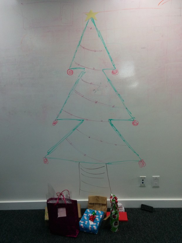
Hacky Holidays
Posted by fe in Uncategorized on December 22, 2015
Quick tree hack for you all.
Thanks for reading this year. May it snow or shine, whichever is appropriate for your geography!
Information gathering – a woolly solution
Posted by fe in Uncategorized on December 9, 2015
The best thing about a physical wall, in my mind, is the interactiveness of it. The easier it is to engage with something, the higher the collaboration, understanding, learning. So I was pretty interested when I saw this in street the other day. What was going on? What problem were they trying to solve with this?
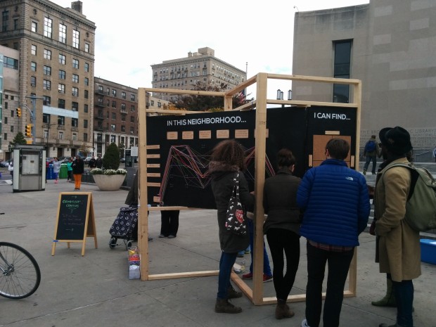
The local community had realised that despite having a lot of American Census data about their neighbourhood, there wasn’t any qualitative information gathered – things like how people perceive their community and how they want to see it. So they wanted to survey the community, and get data they could correlate with the census data. But they also wanted to overcome the problem of getting people to participate. They didn’t want another boring survey, they wanted something that was fun and easy to interact with.
They set up an intriguing information radiator outside the library, on a market morning. And it worked. There was no need to entice people to fill in surveys because people couldn’t help but stop to look. And then, they took a piece of wool and tied it to the pins that represented how they felt about their neighbourhood. The same kind of questions that you’d get on a standard survey, but much more fun to answer.
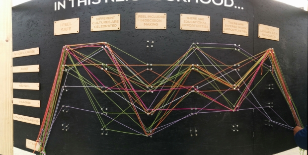
Different coloured wool represented different demographics within the neighbourhood. And they match the demographics from the American Census, so data can be correlated accordingly. (I got to tie on a white string).
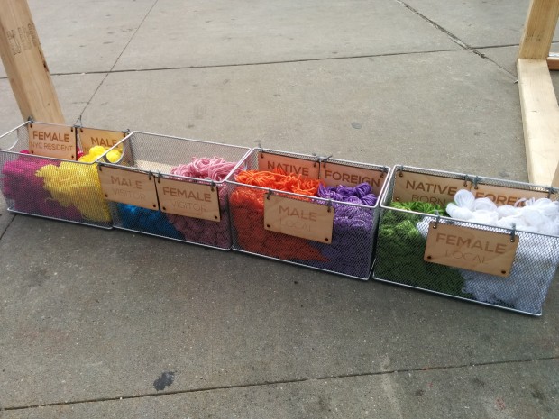
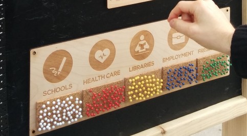
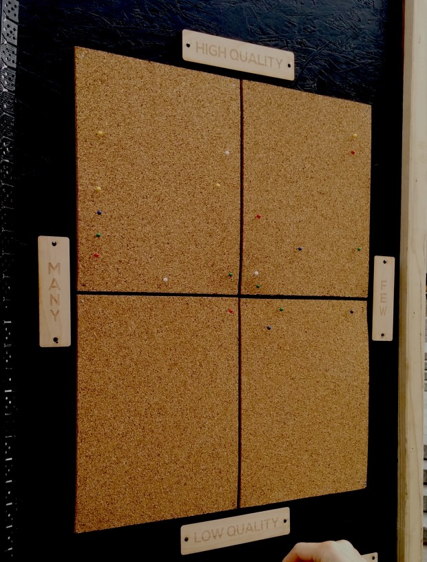
On the back of the board there were some more traditional activities going on – collecting suggestions on post-it notes as well as quadrant mapping feelings about various neighbourhood facilities.
It was a great reminder of how the physical and interactive can engage and delight, and of the importance of making it easy to interact with. I’m looking for a reason to use this at work soon…
For more information, see Community Census.
Remote retro
Posted by fe in Uncategorized on December 4, 2015
At first glance, this is not a board hack. I’ve been working more and more with remote teams lately, and that makes the use of physical, easily hackable materials much more difficult. So my concept of a hack has altered slightly. What ‘hacks’ to the physical process will make it work for a team that is not co-located?
I’ve run retros where a couple of team members have been remote. And I always make sure to enable them to participate as fully as possible in the physical sticky note activities – by getting them to message/slack.text them to me so I can write them up. But what about when everyone is remote? What happens then? Last week I ran my first retro where the entire team was remote. That’s right, not one of us was in the same room!
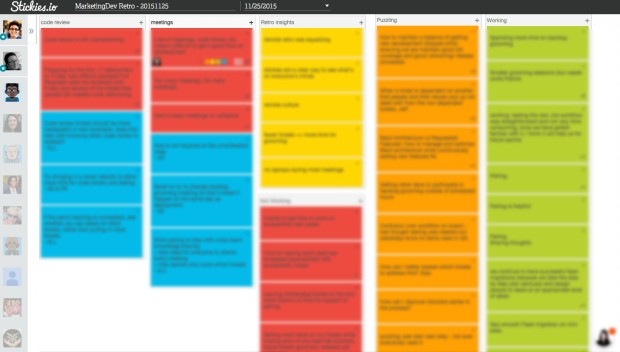
So my beloved post-it notes were replaced with a tool called stickies.io. It lets everyone log into a shared ‘wall’ where they can individually create sticky notes, then we can group them, vote on them and discuss them. We used Google hangouts, with chat and also Slack for text communication. It certainly was not as good as a physical interaction, but it turned out better than I expected.
What did we learn?
- The experience was “equalizing” – we all learned what it felt like to be someone working remotely. Usually this team has 4 or 5 people co-located, and they tend to get most of the air time in meetings, having everyone remote meant the interactions were more equal.
- Facilitating when you can’t see people’s faces is difficult. It took a while to get used to scanning Hangouts, watching the chat, Slack and reading the sticky notes. Practice makes perfect!
- We had to turn off video because the connection was dropping out. This improved the connection, but the facilitating was even harder.
- stickies.io is tricky to use on a small screen with so many people (easy to stick notes on top of one another, and group them by mistake). But it is infinitely scalable so a big screen made a big difference.
- For me, the cognitive load of interacting with the technology (typing, organising stickies) whilst facilitating was much more difficult than dealing with physical post-its, so having a second person move the sticky notes around and another capture actions while I facilitated helped a lot. This will probably get easier the more time I do it.
- It’s can be to tell who someone is from their stickies.io avatar, especially if it doesn’t match their Slack and their Hangouts avatars. Next time we might preface each sticky with the author’s name.
- We were pretty good at not talking over each other. This team is used to having 3 or 4 remote members at any one time, so they are aware of this already, if you’ve working with a team not used to this then you might need some tactics to combat it.
stickies.io has a handy feature that allows the facilitator to switch the board to incognito mode so that everyone can focus on just their own stickies – solo brainstorming. Of course, there’s always someone who wants to game the system, so in less than a minute one of our developers had hacked this too. Not quite the kind of hack I hope for…
Lego Board
Posted by fe in If we tell you we'll have to kill you on August 28, 2015
This lego board serves a particular need by a team in a unique way – like all the best board hacks do.
This wall is used by a procurement team for a large organisation as a place for conversations about the status of various procurement projects. As well as the usual conversations around current status, blockers, progress, the team wanted to have visual indicators that would prompt them to have conversations about how long a project had been running, what stages of procurement it had already been through, etc.
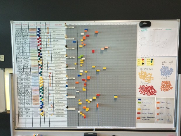
Prototyping to learn
The team started by quickly building a prototype wall using index cards with mail-merge stickers on them describing each procurement project. This information had previously lived in a spreadsheet. With the work quickly thrown up onto a wall, they asked themselves the question: “What is this wall not telling me?”.
Answer: a lot! There were so many cards it was hard to see what was going on. They were hard to read. And the wall couldn’t tell the team anything about cycle time: how long was each project taking to go through the whole procurement process?
Additionally, one of the team members had a visual disability, so the team wanted something with high contrast and large lettering. This was going to be hard to achieve with cards, given the number of procurement projects which were in flight at any time.
With this learning, the team built a second board, this time from Lego.
The board now
The left hand side of the wall is fairly familiar – a line for each project, with columns for portfolio (coded by colour), category and status, as well as the cost of the project. It’s over on the right that the fun begins. The grey lego base board is divided horizontally into sections for each team member – who is limited to no more than 7 projects on the go and has their own little lego avatar and a “one brick” row 2 lugs high for each project. Vertically, the board is divided into weeks.

Team members get their own minifigs and each is limited to 7 lines and therefore 7 projects.
Each project is tracked using a lego brick. The size of brick indicates expected length of delivery of the project and the colour indicates the procurement stage that the project is currently in.
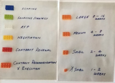
Brick colour represents process steps. Brick size represents T-shirt – size estimates.
At the beginning of each stage of procurement, a project’s lego brick starts in week 1 and progresses on from there. At the end of each stage, the number of weeks spent is recorded on the edge of the brick using a sharpie, the appropriate colour brick for the next stage of the procurement process is stacked on top of the previous, and the stack of bricks goes back to week 1.

Each lego layer shows cycle time for a stage of the procurement process in weeks, together making up the whole project.

Team members can read weeks of cycle time for each project off the scale at the top.
So it’s easy to see:
- how long a project has been in it’s current stage according to the week column it is in;
- the stages it has already been through by the different coloured bricks in it’s stack – not every project uses all steps, so it’s easy to see, for example, when a project hasn’t gone out for RFP as there will be no white brick in it’s stack);
- which stage any given job is at by the top coloured brick;
- whether it has been longer than planned in a stage – for example a medium-sized brick shouldn’t be sitting out at week 14; and
- how long in total it’s been on the go by quickly adding the numbers on the sides of the bricks.

Who invented the post-it note? And why?
Posted by fe in Uncategorized on April 25, 2015
Source: http://meatfighter.com/postit/
Funnliy, for someone who uses so many post it notes, I have never asked myself this question. (I am a little embarrassed by this since ‘Why?’ is such a fundamental question in Agile Coaching!} Today, by accident, I discovered the answer.
In a book for Agile stationery-lovers everywhere, The Perfection of the Paper Clip, author James Ward reveals the answer:
“The Post-it note came about by accident, really. There was a guy called Spencer Silver, who was working at 3M. He was trying to come up with a really strong glue. Unfortunately, he got the formula wrong and created a very, very weak glue, which is not much use if you’re a company that sells glue. There was another colleague there called Art Fry, who as well as working for 3M, he was in a choir, and he used to use little pieces of paper to mark the pages in his hymn book. And those bits of paper would keep falling out, and he thought, oh, if only there was some kind of weak glue that I could use to stick these bits of paper in the book … and that’s how the Post-it note was born.”
Ironically, a solution looking for a problem!
Read more about the book and listen to the author on NPR radio here. For more on the history of the post-it note, visit the post-it website.
A Most Excellent Roadmap for your Adventure
Posted by nthorpe in Uncategorized on April 14, 2015
Like they say at UK.gov, ” if you’re gonna build a time machine into a car, why not do it with some style?”
This post is so perfect, we just had to link to it. Read and enjoy.
http://www.mindtheproduct.com/2014/07/experiments-roadmapping-gov-uk/
Worst Jobs in History: Who sits where?
Posted by nthorpe in If we tell you we'll have to kill you, Uncategorized on April 9, 2015
Here’s a candidate for the worst job in history. Put your hand up to be the one who figures out who sits where in an office, when there is a move or a restructure on. An endless cycle of creating spreadsheets, consulting with people, updating spreadsheets, consulting again. And no one is allowed to see it until it’s final for fear that they complain. What a nightmare.
But my friend Nat has it figured out. The ultimate transparency in seating plans. Instead of the endless rounds of secret consultations, and paper updating, he creates a place for conversation and thinking about who is going to sit where. On his filing cabinet, he sticks up a seating chart and uses people-shaped memo magnets, colour-coded further with liquid paper and highlighters to represent different teams:
Each team can see where they are sitting, and can try out different combinations with Nat. “What if we did this?…”
It’s easy to update and change, you never have to worry about accidentally deleting someone (you can’t lose these magnets, they are so strong that if they are anywhere near the filing cabinet they will home in like an exocet missile), and if you need a soft-copy – just snap a picture.
(But what if you don’t have a handy filing cabinet? Aussiemagnets.com.au also stock a range of flexible iron products that can make a magnetic surface where there is none. Want to use magnetic cards but you have a glass wall? You can attach flexible iron to the walls with double-sided tape, and the whole area is magnet-friendly.)
Spotted: If we tell you we’ll have to kill you.
Epic status
Greater visibility to stakeholders: it can be an ongoing battle. Even when they’re au fait with the vagaries of ‘when we finish this we’ll start on the next priority feature’, keeping them up to date can be tricky. And what about the “zoom level”? Stakeholders want to see the big picture (roadmap) and the detailed planning.
We see teams tackle it many different ways, and often end up with a separate backlog of epics, or a feature roadmap, or future sprints mapped out across the wall. Craig of Better Projects sent us this hack by colleague Ben Birch at Aconex. It gives tight focus to the team’s work, without the need for a separate wall for a roadmap.
They simply added a lane around the outside of the sprint board, which indicates the flow of epics through their development lifecycle – from the backlog, through planning, development and release. Epics travel across the top of the board – the further they go, the nearer they are to completion.
![]()
Epics start their journey in the backlog. The priorities are fairly fluid here, as priorities change and new features are added. Realistically, anything not in the top two or three epics is aspirational. And with multiple stakeholders, this is where the horse-trading of priorities can take place. These epics haven’t yet had much work done on them — and commonly haven’t been broken down into stories.
An epic in the planning stage is in the process of being broken into stories and analysed through more carefully. The product owner is working on them, perhaps there UX investigation going on, or there may be some spikes in play.
An epic moves into in progress when work starts on the first story card.
Story cards for the epic are added to the stories backlog on the main, internal area of the board — and colour coded to match the epics in progress.
In the picture we can see one green epic nearing completion, with another blue epic just beginning. It’s worth noting that all the stories for an epic are added here, there is no separate backlog for stories. When necessary, the team will draw a line through the story backlog to indicate where they plan to get to within the current sprint (not shown in this picture).
Post-it note pro-tip
Posted by fe in In the Agilista's Backpack on November 27, 2014
Did you know there’s a wrong way and a right way to use a post-it?
If you peel them off the pack upwards from the bottom corner, they tend to just curl up and fall off the wall – especially with modern paints which seem to be chemically engineered to repel anything. I noticed half my retros were ending up on the floor and I spent a lot of time picking up pesky post-its and slamming them back up on the wall, only to watch them fall again. I was like that clown at the circus, running from spinning plate to plate, trying to keep them all in the air. Then someone showed me the right way – peel them off the pack sideways to avoid adding any curl. Your post-its will stay stuck much longer.
Bart Vermijlen explains it really well here: http://www.bartvermijlen.com/how-to-peel-of-a-sticky-note/

The right way!