fe
This user hasn't shared any biographical information
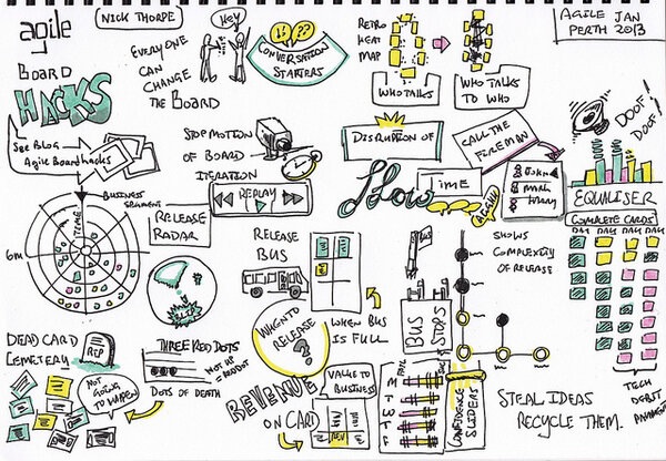
Agile Board Hacks Visualised
Posted in Other Random Hacks on June 9, 2013
Okay, so this isn’t actually a hack. But it’s too beautiful not to include on the blog!
In January Nick was special guest speaker at the Agile Perth Meetup. Check out this visualisation that Gary Barber (@tuna) created while Nick spoke. We think it captures the spirit of Agile Board Hacks perfectly!
Dependency mapping
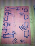
Posted in Telstra Contact Solutions on April 20, 2013
An Agile world without dependencies would be a wonderful place. Each piece of work could be executed independently of any other, in any order. In a perfect world it all works out just like this. 😛
But much as we would like it to be, it’s not always like that. Dependencies are real. For example: hardware might be required to provide the value the end-customer wants. And until it’s in place – either for development, or testing, or production – you just can’t create that value. Dependencies are especially common in large, distributed pieces of work where one team will depend on the work of another. Ignore them at your peril.
The board below is one of those situations. A large program of work spread across multiple teams, with dependencies between teams. Caleche Watson, the project manager on this team has mapped out the dependency using a piece of string, so its clear where it lies.
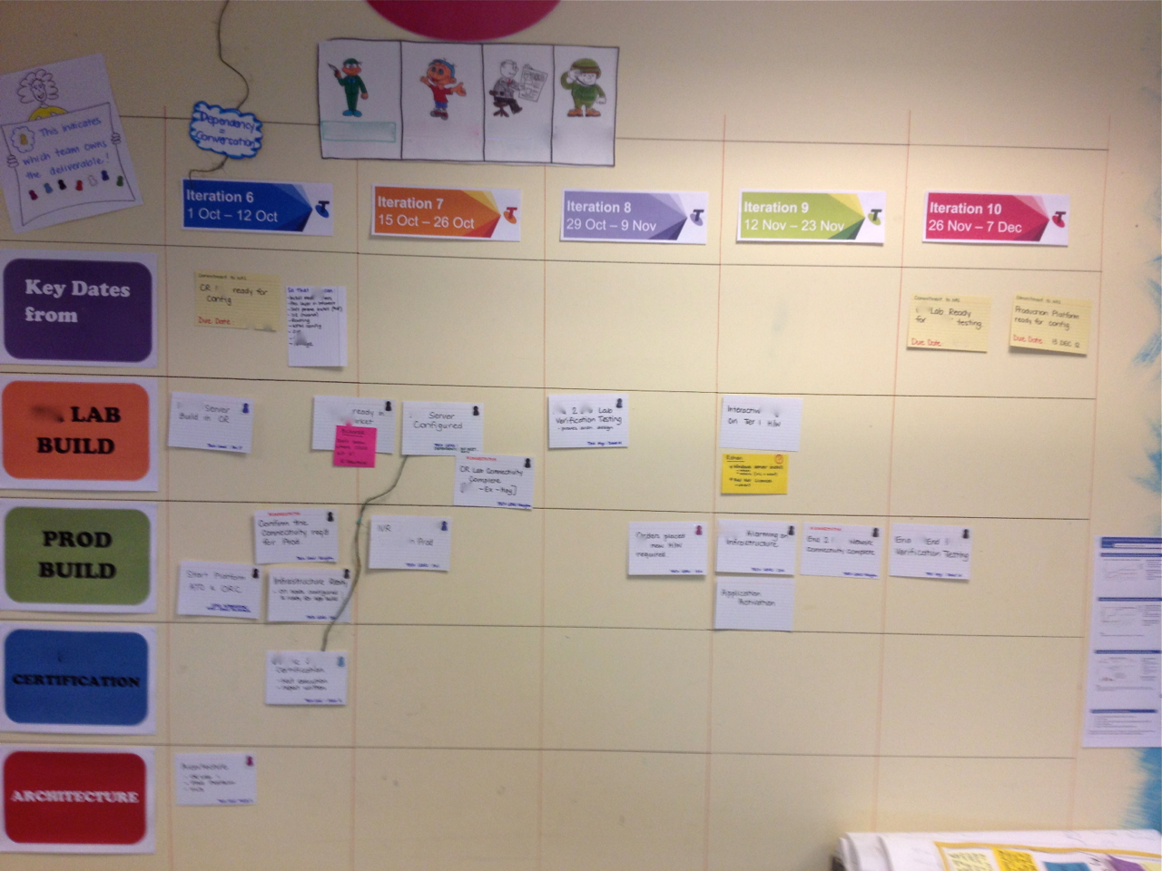
A piece of string shows the dependency between two pieces of work.

Teams which depend on each other need to talk a lot to keep in sync and ensure the best outcome overall. This piece of string makes obvious a conversation that needs to happen at their regular joint stand up. As Caleche said:
“At the end of the piece of string is a conversation”.
Spotted: Telstra Contact Solutions
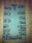
Standup Heat Map
Posted in Telstra Contact Solutions CCRI Team, Uncategorized on March 5, 2013
Following on from the retro heat map, how about a standup heat map?
David Colls realised that his standup had become 2 separate conversations: the team’s shared conversation at standup had been lost. So he made a map of who spoke to whom at standup to show what was really going on. With the team currently working on 2 pieces of work which were not directly related to each other the dialogue was fragmenting. A good topic for retro?

Are you sleeping?
Posted in If we tell you we'll have to kill you on March 2, 2013

Here are some interesting facts* about (lack of) sleep that you may not know:
- seventeen hours of sustained wakefulness leads to a decrease in performance equivalent to a blood alcohol-level of 0.05%.
- a new baby typically results in 400-750 hours lost sleep for parents in the first year.
- it’s impossible to tell if someone is really awake without close medical supervision. People can take cat naps with their eyes open without even being aware of it.
How does that affect you at work? My mate Dave knew it affected him badly, so he came up with this visual hack to let people know how he was feeling. He says:
“We’d just had Hamish, and were in the sleeplessness death zone a lot of the time. But at work we were in the crucial months of getting data ready for a new site, and I was the go-to guy for a whole bunch of content things. Some days I was capable of rational thought and decision-making; others, not so much. So this meter helped give people a kind of reliability quotient for anything I said that day.”
Thanks to David Burnett for this hack.
*Source: The National Sleep Research Project via abc.net.au
Mapping progress
Posted in LP Content Desk on November 12, 2012
Teams track progress in many different ways. Most commonly I see variations on a burn down chart. But if you’re finding that a little bit boring, then there’s no reason not to get creative to illustrate progress.
Here’s an idea from a team working their way through every country in the world. Each country gets coloured in as it is completed. Stakeholders can see the progress as it happens, and also whether the country they are interested in has been completed yet. If you click on the image below, the animation shows the progress over a few weeks.

Spotted: LP Content Desk
A fresh set of eyes…
Posted in If we tell you we'll have to kill you, Uncategorized on September 10, 2012
After spending a day with a new team setting up their first agile wall, I was surprised to come back the next week and see a pair of binoculars on one of their desks. When I asked about them it turned out that one of the team was using them to read the board without having to get up from his desk.
Brilliant! Why have I never thought of doing this???? I just squint at the board or walk back and forth from my desk.
Of course, a fresh set of eyes will always come up with a new way of doing things. What could do with a fresh set of eyes in your team?

CC image courtesy of drtel on Flickr
What we said vs. what we did
Posted in Lonely Planet, Lonely Planet SPP Dev Team on April 14, 2012

Are the stories that are talked about in planning always the ones that actually get played during a sprint? In an ideal world they are, but seldom does a sprint run according to the ideal.
This team was getting a lot of work done, but still seemed to have cards left over at the end of a sprint. Were the cards taking longer than expected? Were additional cards being added? No one could quite be sure.
One of the team members came up with a solution. After the team had agreed the stories that would be played for the upcoming sprint, he took a photo of the cards. This provided a visual record of what the team had agreed would be done.
It was stuck up next to the backlog and as cards were completed they were ticked off on the photo. At the end of the sprint it was easy to see what had got done, or not, out of the planned cards, and which new cards had been added into the sprint.
This is a great example of a team member taking matters into their own hands and using their own visual language (photographs) to come up with a fresh take on planning.
Spotted: SPP development team
Retro Heat Map
Posted in Lonely Planet SPP Dev Team, LP Content Desk on April 14, 2012
Retrospectives are the place for everyone to have their say on what’s working and what isn’t. But does everyone have their say? Who’s talking? Who’s not?
Sometimes it’s hard to tell who speaks and who gets drowned out. To get to the bottom of this, one of our team began mapping who spoke during the retro, almost as a doodle. It’s a simple idea which has been evolved by other members of the team as they had a go at it. The latest incarnation of the heat map shows who is interacting with who. The secret sauce here is empowerment. This mapping process started because Dan felt empowered to just do it, and each subsequent team member who evolved the map felt empowered to adapt and improve it.
When you can easily see who’s interacting and who’s not, you can see where the whole team is missing out on important contributions from some members, and we can ask why.
The Naughty Corner
Posted in Lonely Planet on April 14, 2012
At Lonely Planet, it’s not just software development teams that use big visual indicators. In this hack, the guidebook commissioning team wanted to be very clear just what they were working on at any given time.

Here you can see what’s in pre-planning, currently being contracted, which books authors are researching and writing now, what’s in editing, at the printer and has just hit the shops. Also visible at a glance is what is blocked right now – there’s a special naughty corner for books that can’t be researched due to civil unrest. No authors in Libya right now!
I particularly like the little magnetic book covers that they use – visual language everyone involved in publishing can understand, and much more durable than paper and blue tack.
Thanks to Dave Carroll for this hack.
Spotted: LP Commissioning Editors
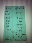
Who knows what?
Posted in Lonely Planet, LP Content Desk, Telstra Contact Solutions on April 14, 2012
A self-serve training plan.
 The team that I work with runs a complex process involving many steps that require specialized knowledge for each step. Their aim is to have everyone skilled up on all the steps, and avoid single points of failure. It was pretty hard for team members to know who knew what, and we needed to be sure when Christmas holidays came along that the few people left knew enough to keep the process rolling.
They came up with a visual to solve this. This grid lists all the steps in the process across the top, and all the members of the team down the side. A half circle means that person has learned the task, two half circles means that they know it well enough to teach someone else. And the little avatars across the top next to each step show who the expert is for that step – and therefore the best person to go to with questions.
As well as being a self-serve training plan – it’s easy to see what each person does and doesn’t know and therefore make sure they learn new steps – it also highlights areas of risk. In this picture we can see that the last step, with only one person knowing how to do it, shows up a pretty big risk if that person is away.
Below, you can see this “self serve university” at a massive scale. This time it covers more than 100 niche skills, and 80 people. The principle is the same: people can mark each skill with either “I know this skill”, “I want this skill” or “I can teach this skill”.

Spotted: SPP Content Desk, Telstra Contact Solutions